Pantone Color of the year 2026: The Trend and Its Powerful Impact on the Design World
Each year, the announcement of Pantone Color of the Year always becomes an exciting moment to wait for many designers, brands, creative industry workers, and fashion lovers. The chosen color will be the global visual trend symbol and affect various fields, such as branding, interiors, product packaging, and digital design.
Recently, some chosen Pantone colors represent more of the social condition, technology, and the changing lifestyles of the people all over the world. The Pantone Color of the Year 2026, PANTONE 11-4201 Cloud Dancer, has become the focal point of attention. People wonder how this color will shape the design trends, branding, or visual expression in the future.
2026 is predicted to bring a color approach that is more emotional, immersive, and oriented to deep visual experiences. So, what color will possibly be the dominant one next year?
In this article, we will explore the prediction of the color trends of 2026, the potentially popular color characters, and how brands and designers should leverage the Pantone Color of the Year to create a more relevant, modern, and appealing visual for the audience.
Table of Contents
What is Pantone Color of the Year?
The Pantone Color of the Year is an annual program established by the Pantone Color Institute to choose a color that is considered to represent the global atmosphere, cultural trends, technological development, and the changing behavior of civilians during a specific period.
In 2026, Pantone officially chose PANTONE 11-4201 Cloud Dancer as the Pantone Color of the Year. It is a soft, warm off-white hue that represents serenity, balance, and the spirit of the beginning.
The existence of this color becomes the center of attention, especially for designers and brands. They begin to think how this visual trend will be if applied in various creative industries, including branding, graphic design, and digital content.
Each color is chosen through a thorough research process by considering various sectors, like fashion and lifestyles, entertainment industries, technology and digital media, interior designs, branding, marketing, and the social trends ongoing globally.
The main purpose of this program is to provide color inspiration that can be used by creative professionals in creating artwork relevant to the era’s development.
Why is the Pantone Color of the Year Impactful?
The Pantone Color of the Year is not just a mere annual color trend but also represents the cultural changes, consumer preferences, and visual development that happen globally. That’s why the Pantone Color of the Year 2026 becomes one of the most awaited topics for designers, brands, and more.
Become the Global Visual Trend Reference
Each year, the color chosen as the Pantone Color of the Year often becomes the reference for the graphic designers, illustrators, photographers, and creative directors in developing the new visual concepts. The existence of this color trend helps creative professionals create designs relevant to the development of aesthetics and global audience preference.
Used by Big Brands
Many brands and global companies adapt this Pantone color trend in their varied visual needs. From marketing campaigns and product packaging designs to brands’ visual identity, the use of the popular color certainly helps create a more modern and fresh nuance that matches the market trends.
Affect the Social Media Aesthetics
Color trends also have a significant influence on the visual appearance of content across social media platforms such as Instagram, Pinterest, TikTok, and Behance. Popular color palettes often inspire the creation of feeds, templates, carousel posts, and various digital promotional materials, helping them appear more engaging, visually appealing, and relevant to their target audience.
Impact the Packaging and Modern UI
Designers also apply Pantone color trends in various digital designs and product developments, in addition to print media. Designers often leverage those colors in design applications, websites, digital dashboards, and product packaging to create a fresher, more modern, and more appealing appearance in an effective manner.
The Prediction of Color Direction in 2026
The existence of the Pantone Color of the Year 2026 Cloud Dancer gives a new direction to the modern design trend. This soft, warm off-white hue represents serenity, balance, and simplicity while encouraging the use of cleaner, more natural, and more emotional colors. The color trends of 2026 do not only put emphasis on aesthetics but also on how a color can create a more comfortable atmosphere and visual experience for the audience.
Emotional Tones
Color in 2026 serves not just as a visual aspect but also as an environment and emotional experience creator. The soft and light colors complement the palette’s low contrast to give a sense of peace, comfort, and uniqueness. Soft and relaxing colors in branding or visual material can assist in developing a closer contact with the audience by making it appear warmer, more current, and more acceptable.
Clean and Neutral Digital Palettes
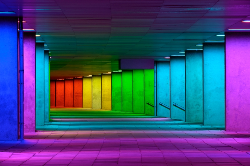
Cloud Dancer also opens up opportunities for the development of a cleaner and more neutral digital palette. In UI design, websites, technology branding, and digital content, soft white can serve as a flexible visual foundation when combined with colors like light gray, beige, soft blue, or charcoal. This combination creates a modern, minimalist, and elegant look that remains comfortable to use across various digital platforms without feeling rigid or monotonous.
Nature-Inspired Palettes
Color palettes inspired by natural elements are estimated to be a strong color trend of 2026. These palettes are inspired by clouds, sand, stones, linens, young soil, and smooth leaves, presenting an organic, authentic, balanced impression that gives an alternative to intense digital appearances.
Warm Minimalism
In 2026, minimalist design is expected to evolve into a warmer and more human-centered style. Color palettes featuring off-white, ivory, cream, taupe, soft brown, and other natural tones create designs that feel simple yet elegant, comfortable, and emotionally engaging.
How Brands Use the Pantone Color of the Year
Brands can leverage the Pantone Color of the Year 2026 as their reference to update their visual appearance, maintaining relevance amidst the rapid development of design trends. In its application, Cloud Dancer does not always have to be used as the primary color. It can be the base color, the balancing element, or a visual accent that evokes a sense of cleanness, serenity, and modernity for various branding needs.
Visual Campaign
In visual campaigns, the Cloud Dancer color works perfectly as the main background color, ensuring that the message, product, or headline is the center of attention. This color is especially ideal for minimalist, calm, and modern campaigns.
Product Packaging
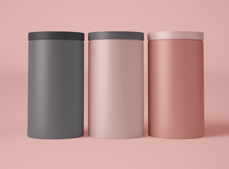
In packaging design, the Cloud Dancer color can create a clean, neat, and premium impression. To make sure that the appearance does not look too simple, you can combine it with other design elements, such as textures, emboss finishing, or contrast yet smooth accent colors. This combination offers a stronger character for the packaging.
UI and UX Design
In UI/UX design, Cloud Dance is an excellent base color for making a website or application interface appear light and easy to read. This neutral color allows other visual elements, like icons, pictures, and buttons, to stand out more clearly.
Social Media Content
For social media content, Cloud Dancer can be applied to feed templates, carousels, product highlights, or promotional materials. The use of this color helps create a more consistent, clean, and flexible content appearance, especially if combined with various visual styles.
Accent Color for Branding
The Cloud Dancer color can also be the accent color in a brand identity without having to disturb the primary color. The combination of this color with colors like charcoal, beige, sage green, soft blue, or earthy tones can produce a balanced, modern, and warm brand appearance.
Do Brands Need to Follow the Pantone Trends?
The answer is no. Even though the Pantone Color of the Year often becomes an important reference in the design and branding world, the top priority of every brand should be on their already established visual identity.
Following trends too closely will cause a brand to lose its identity and consistency. That is why color trends are best employed as a source of inspiration to refresh campaigns, content, or certain visual elements, rather than to alter the brand’s overall value and personality.
Pantone Color of the Year and the Evolution of Visual Trends
The Pantone Color of the Year is more than just an annual color trend; it also reflects societal developments, technological advancements, and visual preferences that influence the design industry. Pantone Color’s Cloud Dancer shows a calmer, cleaner design trend with a gentle white color.
Pantone Color of the Year 2026 will be an important reference for the creative industry in determining the visual direction in the future. So, start exploring various color palettes to create fresher and more relevant designs that are suitable for future trends.