Epic Logo Redesign: When and Why Brands Need to Do It
A logo redesign is often a crucial step when a brand wants to appear more relevant, professional, and aligned with its evolving business direction. Over time, a once-strong visual identity can begin to seem less relevant, overly complex, or no longer representative of the brand’s current character. This is where the redesign process becomes important. It’s not just about changing the logo but about updating how the audience recognizes the brand.
However, a logo redesign must be approached with caution. Too drastic a change can cause the brand to lose its previous identity, while too minor a change may not have a clear enough impact. Therefore, this process requires careful consideration.
This article will discuss what a logo redesign is, when brands should undergo one, and key considerations to ensure the redesign remains strong and relevant.
Table of Contents
Introduction to Logo Redesign
Logo redesign is the process of updating a logo’s appearance, whether through an overall update or by making changes while maintaining the brand’s core identity. During the process, designers can adjust the shapes, colors, typography, compositions, or other visual details to make the logo look relevant to the current market.
Unlike creating a logo from scratch, logo redesign usually considers elements from the previous logo that the audience already recognizes. For example, a brand maintains its main colors, icon shapes, or certain typography characters, yet it simplifies the look to be more modern and flexible. Therefore, the new logo feels fresh without making the audience lose connection with the previous brand identity.
While it was mentioned earlier that small changes may not have a significant impact, some brands only need minor improvements. These changes include adjusting proportions, improving readability, or making a logo more user-friendly across digital media.
Basically, logo redesign aims to create a visual identity that is relevant and recognizable. Such modifications are also hoped to support long-term brand development.
Why is Logo Redesign Important for a Brand?
A logo is not merely a visual element that is placed on packaging, a website, or social media—it is more than that. A logo represents the main identity of a brand. From shapes and colors to typography and the visual style, a logo can give a first impression of how a brand is perceived by the audience.
When a logo no longer reflects a brand’s character, it can impact audience perception. The brand can appear less professional, less relevant, or even lagging behind competitors with a fresher and more consistent look.
Logo redesign becomes important due to its ability to enhance the brand image in the public’s eyes. This update isn’t just about making the logo look more modern but also about clarifying the brand’s positioning. For example, a brand that wants to appear more premium, friendlier, more innovative, or more professional needs a visual identity that supports it.
Digital competition intensifies the visual battle. If a logo looks outdated or irrelevant, competitors can easily overshadow a brand. Therefore, it’s important to update your logo appropriately and with careful consideration.
When Does a Logo Redesign Need to be Done?
Brands don’t have to do logo redesign just to keep up with trends. However, several signs may indicate that an old logo needs to be evaluated to ensure it remains relevant to the brand’s development.
- Outdated-looking Logo (Compared to the Competitors)
If a logo starts to look outdated while the competitor is fresher and more professional, a brand becomes less relevant. A logo update can help a brand maintain its modern impression without losing its main identity.
- Positioning Shift in a Brand
When a brand wants to change its image, for example, from casual to premium or playful to professional, its logo should support the need for a positioning shift.
- Change of target audience
The change of target audience often needs visual style adjustment. A logo that was effective for a brand’s previous target audience may not be as effective in attracting a new audience with different preferences, characteristics, and expectations.
- Business Expansion
When a brand begins to add products or services or come into a new market, visual identity should be flexible. A logo that is too specific to a product or segment can limit the brand’s room for future movement.
- Inapplicable Logo
Too detailed small text, or unreadable small-sized logos, will be a problem when applied across websites, applications, and social media. In this condition, the logo needs a simplifying action to make it more responsive and easy to use on various digital formats.
Logo Redesign vs Logo Refresh
When updating a visual identity, the terms “logo redesign” and “logo refresh” are often interchangeable, even though they involve different levels of change. Understanding this distinction is crucial for brands to determine whether an existing logo needs a complete overhaul or simply refinement in specific areas.
A logo refresh is a minor update that doesn’t change the logo’s core identity. Typically, this process involves adjusting colors, spacing, proportions, or line thickness, or simplifying details. The goal of this update is to make the logo look cleaner, more modern, and more usable across various media.
Meanwhile, a logo redesign is a more substantial, strategic change. This process can include changes to the shape, typography, symbols, composition, or overall visual direction. The most common reason for a logo redesign is when the existing logo no longer aligns with the brand’s positioning, target audience, or development.
For example, a refresh might involve updating the color or improving spacing to create a more balanced logo. Meanwhile, a redesign might involve significantly changing the logo’s shape or creating a new logo that better aligns with the brand’s current identity.
Successful Logo Redesign Cases
Several major brands have done logo redesign to adapt their visual identities to current needs. These changes don’t always involve eliminating old characters but can involve simplification, modernization, or a stronger visual shift.
Mastercard
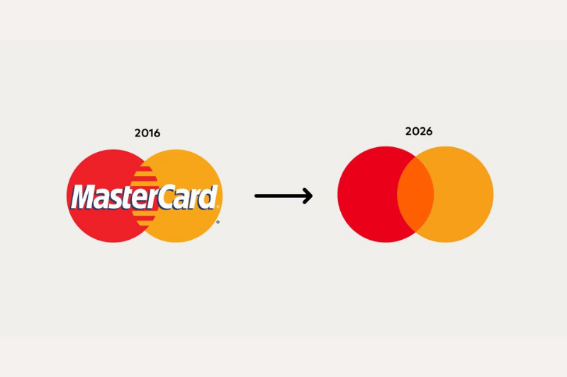
Mastercard is an example of a successful redesign using a simplification approach. The old logo was simplified by retaining the familiar red and yellow circles. This change was successful because the brand remained recognizable but appeared cleaner, more modern, and more adaptable to digital needs.
Airbnb
Airbnb underwent a major identity overhaul with its logo, the “Bélo.” This redesign changed the logo’s shape and reinforced the brand’s concept of belonging. It results in a visual symbol that is more distinctive, simpler, and easier to apply across various media.
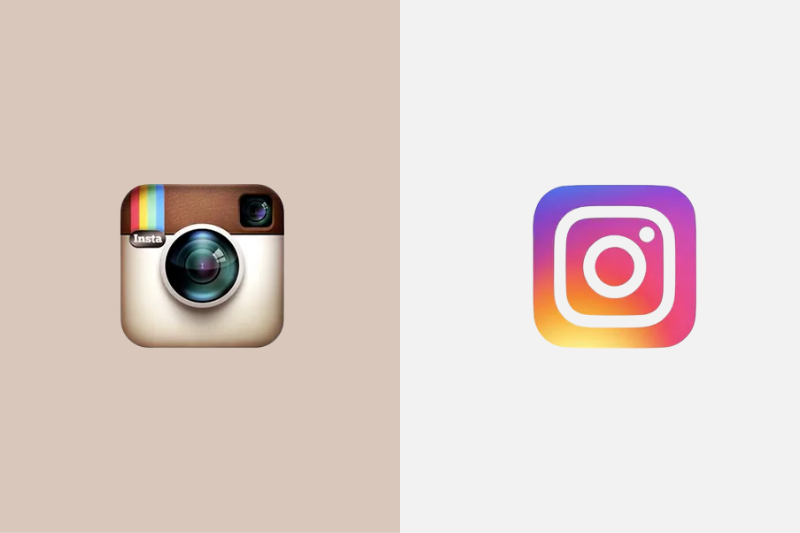
Instagram also recently modernized its visuals by replacing its classic camera logo with a simpler, digitally friendly gradient icon. While initially controversial, this change successfully made Instagram’s identity feel more in line with the era of mobile apps, visual content, and the use of smaller icons.
From these examples, it’s clear that a successful logo redesign isn’t just about creating a new look. The key is maintaining strong elements, clarifying the brand’s direction, and ensuring the new logo ideas are more relevant to today’s media and audience.
Mistakes When Redesigning
Despite a logo redesign aiming to refresh a brand’s look, designers still need to carry out the process carefully. An improper redesign can weaken brand identity, confuse the audience, or make it appear as though the brand is simply following trends without a clear direction.
Here are the mistakes you should avoid:
- Changing the logo just to follow the trends
- Erasing the known brand’s iconic elements
- Making small changes without clear impact
- Not testing the logo in various sizes
- Neglecting communication to the audience
Conclusion: Logo Redesign as a Strategic Step for a Brand
A logo redesign isn’t simply the process of changing the appearance of a logo to create a newer look. More than that, a redesign is a strategic step to ensure a brand’s visual identity remains relevant, recognizable, and aligned with the business’s development direction.
When executed correctly, the new logo can help a brand build a stronger image in the eyes of its audience. However, you need to make sure that the redesign process is done with careful consideration. Brands need to understand the reasons for the change, determine which elements are worth retaining, and ensure the new logo doesn’t diminish the existing character.
In the end, a successful logo redesign is one that looks more modern and strengthens the brand’s identity in the long term. With a clear strategy, a logo update can be a crucial step in helping a brand appear more relevant, professional, and competitive.