
Playful Heavy Font: Why This Style Is So Popular
Recently, we often see the use of a playful heavy font in various designs, starting from branding and product packaging to digital content. This font style combines thick letterforms with more relaxed, playful, and expressive characters that create an appealing look.
These changes happen along with the development of the more dynamic and communicative visual trends. This has influenced many brands to start abandoning overly formal approaches and switch to styles that feel closer to the audience. In this context, a playful heavy font becomes a relevant choice because they can convey a strong yet friendly impression.
Hence, this article will explain why the use of a playful heavy font is increasingly popular and preferred and has many benefits that shape the visual identity, making it livelier and more memorable.
Table of Contents
- 1 What is a Playful Heavy Font?
- 2 Why is the Playful Heavy Font Increasingly Popular?
- 3 The Unique Visual Characteristics of the Playful Heavy Font
- 4 The Impression of the Fonts
- 5 The Use of the Playful Heavy Font in Design
- 6 Tips in Using a Playful Heavy Font Properly
- 7 The Right Font to Combine with a Playful Heavy Font
- 8 Conclusion: A Playful Heavy Font as a Relevant Typography Style
What is a Playful Heavy Font?
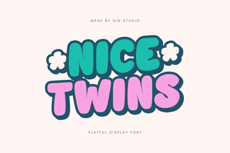
Playful heavy font is a font style that combines thick letter weights with visual characteristics that feel more relaxed, expressive, fun, and not rigid. Unlike other heavy fonts with strong and serious impressions, the playful version presents friendlier and more dynamic nuances.
This font style visually combines solid letterforms with more flexible design elements. Some of them show rounded corners, a slightly asymmetrical proportion, or small details that make them appear livelier. This approach makes the appearance feel more playful without losing its visual power.
The primary function of a playful heavy font is similar to other display fonts: to capture attention. As a result, it is often used in headlines, logos, and key visual elements designed to stand out instantly. Its combination of bold weight and expressive character makes it increasingly relevant in contemporary design.
Why is the Playful Heavy Font Increasingly Popular?
The change in the way brands communicate visually closely ties the popularity of playful heavy font styles. In the midst of the rapidly increasing flow of content, design is required to capture attention in a short amount of time. In this condition, a bold yet expressive font becomes an effective solution.
The following are some of the main reasons:
- It easily attracts attention in a brief time: The bold letterform makes text stand out, even amidst the crowded visual look of social media content.
- This font style gives off a friendly and approachable impression: Unlike other heavy fonts that tend to appear solid and rigid, the playful version presents a more relaxed and communicative nuance.
- Playful heavy fonts are ideal for design trends with a more expressive vibe: Recently, many brands have shifted their style from a rigid, minimalist style to an approach that is livelier and characterful.
- This is effective for visual communication in the digital era: In the context of fast-scrolling content, strong and unique typography makes the design message easier to understand.
- This style is flexible for use across media: The playful heavy font, whether for product packaging, posters, or digital content, consistently gives a strong visual impact.
By combining visual power and a relaxed characteristic, the use of a playful heavy font becomes a relevant option for brands seeking to stand out and build a close relationship to the audience.
The Unique Visual Characteristics of the Playful Heavy Font
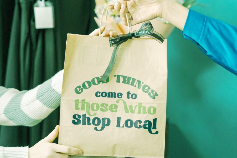
The main appeal of a playful heavy font lies in its visual characteristics that are not only strong but also lively. Unlike rigid and bold typography, this style depends on the details of the letterform, creating a more expressive impression.
The most common visual characteristics we can find are as follows:
- Bold and solid letterforms: It provides a sense of strength and visibility even when we see it from afar or on small-sized screens.
- Rounded corners or organic shapes: The fonts’ letterforms with rounded corners and organic shapes create a friendly and approachable impression.
- Slightly asymmetrical proportions: A little distortion or imbalance actually creates a more playful and less monotonous character.
- Simple yet expressive details: Without excessive decoration, this font still has its distinct “taste” in each of its strokes.
- Flexible spacing: Spacing between the letters is flexibly and dynamically made, allowing the design to look more relaxed.
A visual approach like this makes a playful heavy font feel more communicative. It not only conveys information but also the emotions and tone of a brand directly.
The Impression of the Fonts
Aside from being a visually striking aspect, adopting a playful heavy font allows a design to immediately communicate its message. This ability allows it to function as both an aesthetic feature and a communication tool in a design. The following are the most prevalent impressions when utilizing this style of font in a design:
- Fun and friendly: The relaxed letterform makes a design feel friendlier and more casual.
- Energetic: The heavy weight of the font combined with a playful character creates an active and dynamic vibe.
- Youthful and approachable: This style is often associated with brands aiming for youth and being close to the audience.
- Bold but not aggressive: Despite being bold and standing out, the playful approach retains its light and welcoming feel.
- Slightly quirky and unique: The details of the shape, which are not entirely conventional, add a touch of character that distinguishes it from standard typography.
Interestingly, these impressions appear instantly without having to add additional elements. This is why using a playful heavy font as a design element is popular, as it can directly shape the visual tone from the very beginning.
The Use of the Playful Heavy Font in Design
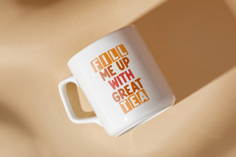
Because of its strong and expressive character, a playful heavy font can be used as the main element in various design types. The function is not merely text but also the center of attention that helps deliver messages more quickly.
The following are the most common uses of playful heavy fonts:
- Product branding, especially F&B and lifestyle: Many food, beverage, or casual products use this type of font to create a more relaxed, fun, and memorable impression.
- Social media content and digital campaign: In a dense feed layout, a playful heavy font helps the text stand out and remain easy to read, even in small sizes.
- Poster and promotional material: This font is suitable for headlines or call-to-action elements because it can attract attention instantly.
- Youth-targeted design: This style is often chosen by brands targeting youth because it feels fresh and not rigid.
On the other hand, the use of this sort of font should be contextually appropriate. Using a playful heavy font is less appropriate for designs with a formal appearance, such as corporate, legal, or financial documents, because it can affect the professional perception.
Tips in Using a Playful Heavy Font Properly
Even though it appears visually appealing, the use of a playful heavy font needs to be carefully controlled to prevent a design from looking overcrowded or becoming difficult to read. When used with the right approach, this style can become an incredibly effective visual element.
There are some things you need to pay attention to:
- Use it as a focal point, not in all elements: A playful heavy font is most effective when used as the center of attention, like in headlines or main titles.
- Combine with a lighter font: Combine a playful heavy font with sans serifs or simple fonts to ensure that the design remains balanced and readable.
- Pay attention to spacing: Because of its bold letters, narrow spacing can make a text appear too tight and difficult to read.
- Limit the use of vibrant color: If the font is already quite “busy” in shape, use more controlled colors to avoid excess.
- Adjust it to the brand’s character: Make sure the playful style remains relevant to the brand identity you want to convey.
By considering these factors, a playful heavy font can provide a strong visual impact without sacrificing overall visual comfort.
The Right Font to Combine with a Playful Heavy Font
To maintain the visual balance, the use of a playful heavy font is the most ideal when combined with other lighter font types. Its purpose is to create a clear contrast and maintain the design’s readability.
The most effective combinations are as follows:
- Simple and clean sans-serif fonts: Sans-serif fonts with neutral shapes help balance the strong, playful character, making the design look just right, not too crowded or minimalized.
- Neatly structured geometric fonts: Geometric fonts give a modern and stable impression while balancing the more free-form letter shapes.
- Thin or regular-weight fonts: Using a lighter-weight font helps create a clear hierarchy.
- Slightly decorated fonts: Avoid combining with fonts that are equally expressive to prevent them from “competing” visually.
The main key to this combination is contrast. A playful heavy font is the primary element that attracts attention, while the supporting font should maintain the structure and reading comfort. With the right pairing, your design will appear neater without losing its main characteristics.
We also provide an article about playful heavy font recommendations to deepen your understanding of this type of font.
Conclusion: A Playful Heavy Font as a Relevant Typography Style
As design trends become increasingly dynamic, playful heavy fonts have become one of the typographic choices that can meet modern visual needs. The combination of bold shapes and expressive characters makes it not only attention-grabbing but also feel more lively and communicative.
This style shows that typography is no longer just a complementary element but an important part of building a brand’s visual identity. With the right approach, using a playful heavy font can help convey messages more quickly, clearly, and memorably.
In the end, the key is not in following trends but in how to strategically use this style. When it aligns with the brand’s character, a playful heavy font can be a strong element in creating a more engaging and memorable design.


