Easy Steps to Design a Logo: A Beginner Guide
To design a logo is something many novice designers take interest in. However, they often feel confused about where to start. This situation leads some beginners to jump straight into creating designs without a clear direction, resulting in designs that appear unconceptualized and lack careful consideration.
In fact, using a structured process to design a logo can be much easier for designers. A clear flow helps designers make every decision, from conceptualization to visual element development.
This article outlines practical steps that you can immediately implement, not just theoretical concepts. Readers will learn the process to design a logo from scratch to ready it for use in a systematic manner. Each stage is structured to help produce an attractive, focused, and professional design.
Table of Contents
Preparation Before Starting to Design a Logo

Before starting to design a logo, there are several basic things you need to prepare to ensure a more focused process. The initial step is to determine the brand or project name, which serves as the primary identity to design a logo. Next, understand your target audience in simple terms, for example, in terms of age, style, or general preferences, to ensure the design is more relevant.
Furthermore, to design a logo, determine the desired character, such as professional, fun, or elegant, as these factors will influence the overall visual appearance of the logo design. Without this preparation, a logo design can lead to a process that lacks direction and produces inconsistent visuals. Therefore, before proceeding to the design stage, it is better to learn logo principles first to achieve a more structured and optimal result.
How to Design a Logo for Beginners

There are several steps that can help beginners design a logo more effectively. Each step plays a crucial role in creating a consistent and professional design. Here are the steps you can implement to simplify the design process:
Find a Suitable Logo Reference
The initial step to design a logo is to find relevant references. The reference will help determine the visual direction before designing a logo.
- Study logos from similar brands
Learn how brands in the same industry show their visual identity. Pay attention to the elements that are commonly used, as well as the differences that make each brand unique.
- Use inspiration platform
Use platforms like Pinterest, Behance, and Dribbble to find some examples to design a logo. From this point, you can explore various visual styles that may be your references.
- Focus to the visual elements
Focus on the important aspects, such as shapes, styles, and compositions. These three elements will help you understand the visual structure of a logo, making it the fundamental elements in developing a design.
Furthermore, following these steps can help make the logo design process more structured and well-organized.
Determine the Desired Logo Type
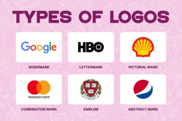
After finding the reference, the next step is to determine the logo type that will be created. The logotype selection helps to clarify design direction and simplify the visual development process, especially for beginners. As the initial step, it’s better to choose a logo that is suitable for the brand image.
- Wordmark
This logotype uses the whole brand’s name, focusing on the typography. This approach emphasizes letter processing and text composition as the main element. This logotype is suitable for brands with a strong or unique name that don’t need an additional symbol.
- Lettermark
Brands with long and complex names often use this logotype due to its difficulty in implementing the name as a logo. This approach is suitable for brands seeking a simple and recognizable look.
- Simple Icon
This type of logo uses a simple symbol or visual form, such as an icon, focusing on easy recognition and low complexity. It is perfect for brands that already have a strong identity, as it takes time to build audience awareness.
- Combination
A combination mark blends text elements and symbols in one unified visual. This logotype is quite flexible because it can be used as a singular or pairing element. The approach is perfect for brands that want to build a strong identity and maintain easy recognition across various media.
In determining a logotype, avoid choosing too complex designs in the initial process. Designers should focus on the simple shape that can help them understand the design better and create a clearer visual.
Create a Rough Sketch
After determining the logotype, the next step is to create a rough sketch as the initial stage of visualizing the idea. This process helps to convey the concept quickly before moving on to the digital stage.
- Use Paper or Tablet
Sketches can be created by hand on paper or using a tablet. Choose the medium that’s most comfortable for a more flexible process.
- Create Some Quick Alternative Concepts
Develop ideas into several concepts quickly, rather than focusing on just one. This aims to broaden your exploration of form.
- Focus on the Concept, not Detail
At this stage, neatness or visual detail isn’t necessary. It’s better to prioritize the concept clarity and basic shape.
Choose a Readable Font
To design a logo, font selection is one of the important aspects. For beginners, it’s recommended to use a simple font to create a clear and understandable design.
- Use a Simple Font
Choose a clean, uncomplicated typeface for readability and ease of use. For example, choose a sans-serif typeface that’s clear and easy to read.
- Avoid Using an Overly Decorative Font
Fonts with excessive ornamentation tend to be difficult to read and can reduce visual clarity. Script fonts are best avoided if you’re not yet familiar with design.
- Make Sure the Clarity on Small Size
Test the readability of the font at various sizes, especially small sizes, to ensure it remains clearly visible when applied.
Choosing the right font to design a logo can influence the result. Hence, it needs careful consideration from an early stage.
Select the Right Color
When you design a logo, color selection becomes a crucial element, as it impacts the impression and character conveyed. For beginners, color use should be limited and not excessive to ensure the design remains clear and easily recognizable. Avoid using too many colors in a single logo, as such choices can reduce visual consistency.
Furthermore, ensure that the selected colors remain clear when implemented across various media, even in small sizes or against different backgrounds. Determining the right color before the process to design a logo makes it more directed, consistent, and professional.
Begin A Logo Digitalization
Once the sketch is finalized, the next step is to convert it into digital form. Designers often use software like Adobe Illustrator or CorelDRAW to get more precise results. For beginners, Canva can be an easier alternative.
During the digitization process, ensure that the design team works in vector format to maintain the logo’s scalability, ensuring it does not break when enlarged or reduced. Additionally, pay attention to neatness of shape, alignment, and spacing to make sure each element looks balanced and consistent. With these steps, the resulting logo will look more professional and be ready for use across various media.
Evaluate the Result of Logo Design
To design a logo, it is important to check and evaluate the design results. This step aims to ensure that the logo aligns with the concept and that you can use it optimally. Check the logo’s recognition level, the elements’ crowdedness, and clarity in small sizes.
Further, observe the logo’s appearance on various backgrounds to ensure visual consistency across different usage conditions. As an additional step, simply ask for feedback from others. This feedback can help identify flaws that may not have been apparent during the design process, ensuring the logo is ready for use.
Quick Tips to Design a Professional-Looking Logo
Several simple steps can help improve the visual quality of your logo design. The consistent implementation of basic principles can make the design look neater, clearer, and more professional. Here are some tips that can be implemented:
- Use Neat Spacing
The space between elements needs to be balanced to make it look structured and understandable. That’s why consistent spacing improves visual readability.
- Avoid Excessive Elements
The use of excessive elements can make design look crowded and difficult to recognize. Focus on the main elements to convey the visual message clearly.
- Use Simple Grid If Necessary
The grid helps maintain proportion and balance between elements. With the help of a grid, design will look more precise and organized.
- Utilize White Space
White space provides a visual pause, preventing the design from looking crowded. In addition, it helps highlight the main elements.
- Maintain Consistent Visual Style
The use of a consistent visual style helps build a characterized identity. That’s why it’s better to avoid excessive design style combinations to maintain harmony.
Design a Logo: Common Mistakes Beginners Make

When beginners design a logo, they often make mistakes in the process that can reduce the quality and effectiveness of the design. The mistakes often occur because of a lack of knowledge of basic principles. Here are some that can be avoided:
- Excessive Colors
Excessive colors can distract from the design focus and be difficult to recognize. It’s best to use a focused color palette for a more consistent look.
- Too Many Fonts
Too many fonts can disrupt visual cohesion. Stick to one or two fonts to keep your design clean and easy to read.
- Too Detailed Logo
Excessive detail can make a logo difficult to recognize, especially at small sizes. A simple design is more effective and flexible across various media.
- Copy without Modification
Copying another design without adjustments can diminish its uniqueness and risk copyright infringement. You should design a logo with a distinctive and original character.
- Forget the Simple Version
A logo without a simplified version will be difficult to use for various purposes. A minimal version helps maintain visual clarity across various sizes and media.
Conclusion
Good logo design can start with simple steps. For beginners, the process to design a logo doesn’t need to be complicated. Focus on basic principles like simplicity, clarity, and relevance to effectively convey a visual message.
With consistent practice, design quality will gradually improve. Therefore, start with a simple logo as a first step in developing your design skills. After that, you can make various types of logos, be they playful logos, minimalist logos, wordmark logos, or emblem logos, to explore different design styles and approaches.