Color Harmony in Branding: Essential Principles & Pairing Techniques for Visual Consistency
Color harmony in branding is a crucial factor in establishing a brand’s visual consistency. Many brands determine their own color palettes, yet the visuals don’t harmonize. The colors are individually attractive, but they are not working optimally when used together in various design elements.
The color imbalance can distract the visual flow and reduce the readability level. Besides, poorly managed color usage can weaken brand identity and create an inconsistent visual appearance across media.
With those in mind, it demonstrates that color selection alone is not enough. Brands need a system that regulates the relationships between colors, so they work harmoniously. Therefore, this article discusses the role of color harmony in branding as an approach to combining colors effectively. Thus, color harmony creates a consistent and purposeful visual across various design media.
Table of Contents
What is Color Harmony in Branding?
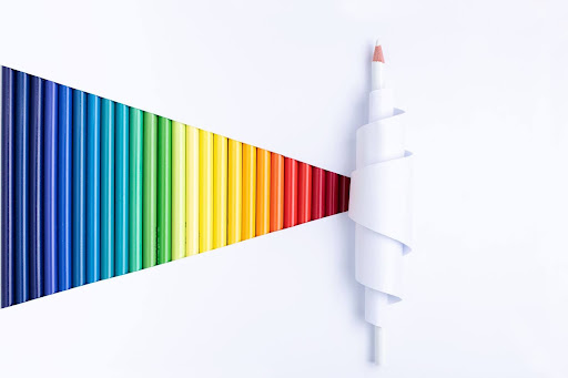
In the context of color harmony in branding, there is a saying that an attractive color is not necessarily harmonious. An attractive color can attract attention individually, but it doesn’t create a pleasing visual appearance when combined with other colors. Therefore, it is important to pay attention to color harmony so that each color complements the other and creates a balanced design.
In this way, the color harmony application can directly impact the audience’s visual comfort. Harmonious color combinations can reduce visual strain and make it easier for the eyes to process information. Besides, color harmony helps maintain the audience’s focus by directing attention to important elements and building a professional impression through a neat and consistent appearance.
In a branding system, color harmony is a part of structured visual identity. Its role is to ensure the colors can be applied consistently across media without compromising the brand character. This aspect also influences the audience’s perceptions and emotions, which is further discussed in Color Psychology in Branding.
Why is Color Harmony Important for Brand Perception?

Color harmony in branding has a crucial role in building the audience’s perception of a brand. A harmonious color combination creates a visual appearance that looks neater and more professional, enhancing a brand’s trust and credibility.
On the other hand, inharmonious color usage can make the visual appearance look crowded and have a blurred focal point. As a result, the message designers want to convey in the designs cannot be delivered optimally. By managing color harmony in branding properly, brands are also able to convey their visual stories and characters more clearly and in a focused manner.
The Main Principle in Color Harmony in Branding
Color harmony in branding doesn’t happen by chance, but rather through a structured application of basic principles. These principles serve as guidelines for organizing the roles and relationships between colors, ensuring a brand’s visual appearance remains balanced, consistent, and easily understood by the audience. Here are some key principles to keep in mind:
The Balance in Visual and Hierarchy
Color harmony helps create a visual balance so that no single element is overly dominant. Furthermore, color is also used to establish a visual hierarchy, making it easier for the audience to clearly understand the sequence of information.
The Role of Dominant and Supporting Colors
Dominant color functions as a brand’s main identity and the focal point in visual appearance. Meanwhile, supporting color serves as a complement and affirms the visual element without distracting attention from dominant colors.
The Color Limit
The color limitation in branding is important to strengthen the brand introduction, as well as maintain the direction of visual focus. Using a limited palette of between 2 and 3 colors and the implementation of the 60-30-10 percent color formula creates a clear visual hierarchy to emphasize the main element and maintain identity consistency across media.
The Relation Between Readability and Clarity
Color harmony provides a visual framework to maintain readability through balanced contrast, while clarity is achieved by using these color differences to clarify the structure of information. In branding, the combination of the three creates a professional impression and ensures the brand message is conveyed accurately.
Color Scheme Technique Usage in Branding
In branding practice, color application isn’t random but rather follows specific techniques to ensure colors work harmoniously. These techniques help brands manage contrast, balance, and visual consistency in line with the desired character.
Monochromatic Color Pairing
Monochromatic color pairing is a color implementation technique that uses one base color (hue) and then develops it with variations of tint (adding white), tone (adding gray), and shade (adding black). This approach supports color harmony in branding by creating a consistent, clean, and professional appearance. Hence, this technique is suitable for corporate brands, elegant brands, or minimalist designs that prioritize visual consistency.
Analogous Color Pairing
Analogous color painting is a color application technique that combines main colors with three or four adjacent colors on the color wheel. This combination creates a natural, smooth, and cohesive impression because the color transition between colors feels soft. Thus, this technique is suitable for branding that aims to create a harmonious, stable, and comfortable atmosphere for long term view.
Complementary Color Pairing
Complementary color pairing is a color application technique that combines two colors directly opposite each other on the color wheel. This combination produces colors with a high level of contrast, creating an energetic, bold, and attention-grabbing visual effect. However, if not combined well, the use of contrasting colors can create visual tension and distract the focus, so proper arrangement of color proportions is essential.
Split Complementary
Split complementary is a color application technique that uses one or two different colors with their complementary color in the color wheel. For example, if we choose blue as the main color, 2 other colors are orange-red and orange-yellow. This technique gives a balance between visual appeal and eye comfort, so, it is widely used by modern brands that want to appear dynamic without appearing too aggressive.
Common Mistakes in Color Pairing
Common mistakes in color pairing often arise from a lack of understanding of the roles and relationships between colors. Even if a color palette has been defined, an inappropriate application can create a visually dissonant feel and disrupt the consistency of a brand’s identity. Here are some common mistakes in applying color pairing to branding:
- Too many dominant colors
This mistake happens when too many colors are used as the main element, making a blurred visual focus. Ideally, one color becomes the primary color, while the other works as complementary.
- An excessive contrast without hierarchy
Contrast is important to attract attention, but without a clear hierarchy, it makes the look feel too strong and tiring. The competition between design elements makes the main message hard to convey. Contrast should work as an element that directs the focus, not creating confusion.
- Color pairing that collides emotionally
Each color has a specific impression and mood. When colors with clashing emotional characteristics are combined, the visual appearance can feel uncomfortable and confusing. Therefore, it’s important to understand that color harmony isn’t just visual; it’s also related to the emotions the audience receives.
- Following a trend without considering brand identity
Color trends can give inspiration, but not always suitable for every brand. Following trends without aligning them with the brand characteristics can make the visual identity inconsistent and boring. A strong brand comes from long-term consistency, not from the color changes that follow the recent trends.
Balancing Color Harmony with the Brand’s Character

Color harmony in branding has a strong relationship with a brand’s personality. Every brand’s character needs a different color harmony approach. Premium brands tend to use calm and elegant color combinations, while playful brands utilize bright colors with dynamic harmonies. Meanwhile, professional brands prioritize color balance and visual readability. Consistent application of color harmony across various media becomes the key to maintaining a strong brand character, being easily recognizable, and feeling unified at every point of interaction with the audience.
Conclusion
Color harmony in branding is not solely an application of color formula, but also a visual system that manages how color works. The proper combination helps create a brand appearance that is neat, consistent, and trustworthy across media.
More than that, color harmony serves as an important aspect in strengthening visual storytelling and maintaining a long-term brand identity consistently. Because of that, it is important for brands to start re-evaluating the color combinations they currently use, to ensure that visual harmony is maintained and relevant to the brand’s character.


