Effective Color Trends of 2026: Visual Directions for Modern Brands
Color trends change along with changes in society, technology, and how audiences interact with brands. Color is now going beyond its aesthetic value. Instead, it becomes an essential part of visual communication strategies. Understanding the color trends of 2026 will assist brands in reading the current visual direction and adapting to match the expectations of the modern audience.
For many brands, color trends are not something to absolutely follow. Understanding trends, however, can be a guide to the latest visual preference, making brands comprehend the audience’s needs and how visual design evolves globally. By doing so, brands can maintain relevance without losing their hard-earned identity.
This article will explore the global color trends of 2026 and how brands can learn and adapt them strategically in their visual identity. You can also read Color Psychology in Branding to Shape Perception and Modern Brand Identity.
Table of Contents
Global Factors That Affect the Color Trends of 2026
Color trends do not appear randomly or instantly. The color trends of 2026 are created by combining various global factors that affect the way people see, feel, and interact with visuals. Culture and the behavior of people are two factors that dominantly affect this shift in trends. Later, the trends become applicable for branding design and visual communication.
The main factors that affect the color trends of 2026 are as following:
-
The Shift of Lifestyles and Needs
The changes in society, economy, and how the audience interacts with brands globally affect visual communication. Many companies are responding to the needs of a more authentic, interactive, and inclusive visual. As the understanding shifts, color is considered something that functions not only to appeal to the audience but also as a tool to build a sense of comfort, stability, and visual relevance.
-
The Development of Technology and Digital Cultures
The domination of digital technology like social media platforms and applications demands a more functional, readable, and consistent color use for various sizes and media. Colors with clear contrast, a clean tone, and strong character become a vital weapon to maintain visual effectiveness.
-
The Change of Consumer Behaviors
Changes in consumer behavior play a significant role in shaping the color trends of 2026. The audience is now more aware of brand value, authenticity, and visual consistency, not just looking at the product. This encourages brands to use color more strategically and wisely.
The Primary Colors of 2026: Strengthened Moods & Categories
The direction of the color trends for 2026 does not specifically focus on the colors but rather the visuals’ moods and characters. This approach enables brands to comprehend the trend without succumbing to monotonous or outdated color choices. In modern branding, color trends are a visual category that represents emotional needs and the preference of the audience.
The following are some color categories of the color trends of 2026:
-
Soft neutrals
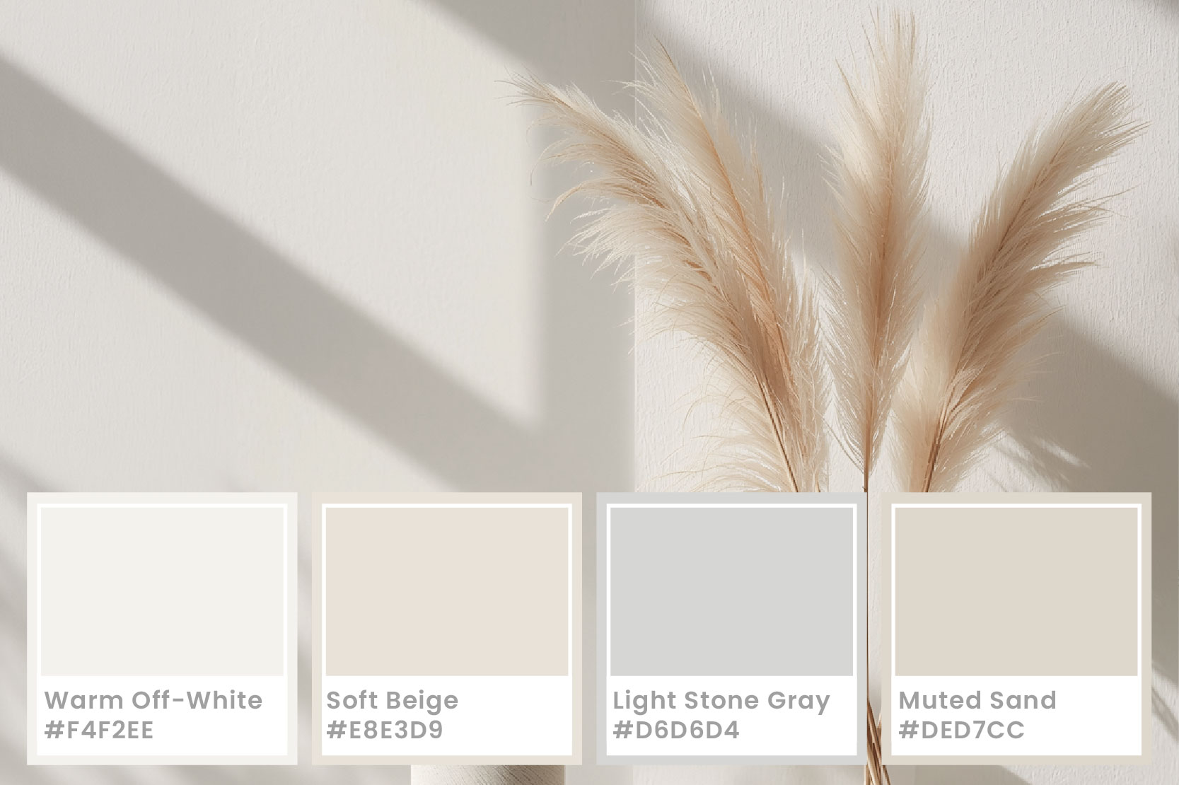
This category has neutral colors with a smooth touch that are soothing, clean, and simple to combine. Soft neutrals are frequently utilized to provide a solid and professional image while also making other visual elements stand out more clearly.
-
Earthy naturals
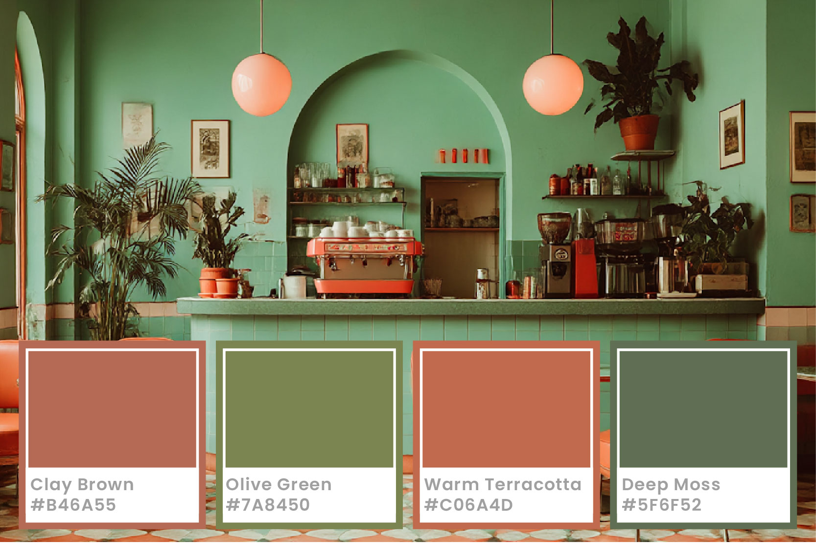
Earthy naturals symbolize nature and organic nuances. This category’s colors feel more grounded and authentic, representing sustainable values, balance, and a connection to the environment. Many businesses use this strategy to create a friendly and trustworthy image.
-
Warm moderns
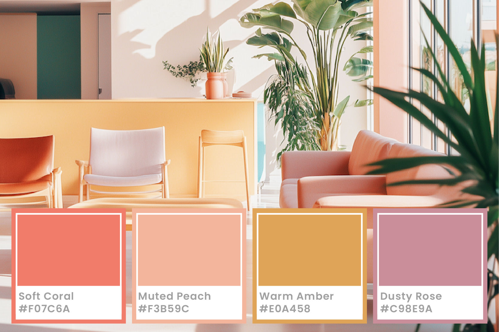
These colors are often used to present an optimistic and human-centric impression. This category combines a warm feel with a modern and controlled visual approach. Warm moderns help brands look friendlier without losing their professional impression.
-
Digital brights
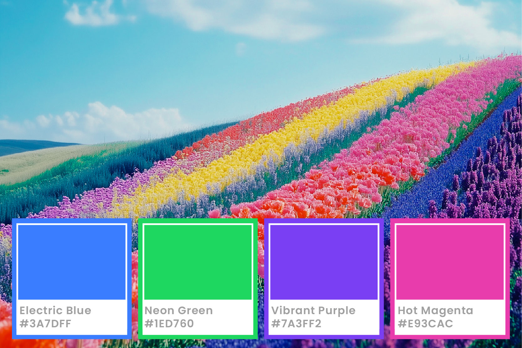
This category has a crucial role in the color trends of 2026, specifically as a contrast. Digital brights depict energy, expression, and the movements of digital culture, but with a more measured approach than before. Bright colors will be utilized sparingly in the future, instead serving as accents to improve visual focus and brand identity.
These categories above show that the color trends of 2026 move towards balance; between calmness and expression and stability and visual energy. Although these color directions do not focus on a specific color, we still provide several color palettes as references and illustrations. By understanding the strengthening categories and moods, brands can read the trend direction strategically without drastically changing their color identity.
How Brands Follow the Color Trends of 2026 in a Strategic Manner
Following the color trends of 2026 does not mean having to entirely change the color palette. Modern branding more accurately understands color trends as guides for visual direction, not as directives for significant changes. A strategic approach allows brands to remain relevant without losing long-term consistency.
Adapting Trends to Brand Identity
The safest strategy to follow color trends is to keep the brand’s primary color consistent. The primary color acts as a visual identity and should be consistent throughout various situations. Color trends can be adapted with slight modifications, such as altering the color tone, experimenting with saturation, or adding accents that reflect the trend’s direction.
This approach makes it possible for brands to maintain relevance with the current trends without having to lose their original identity. You can read the complete explanation of the palette structure and the role of primary colors in the article Color Palette for Branding: The Best Guide to Build Your Brand Colors.
The Effects of Color Trends to the Modern Visuals
Besides affecting the color choice, the color trends of 2026 also shape the design’s visual direction globally. The visual mood shifts towards a calmer, more grounded, and more expressive nuance. Consequently, they also affect the way brands arrange contrasts, visual smoothness, vibrancy, and layout composition.
In the visual direction context, color works along with other design elements to support brand storytelling. Color trends no longer stand as decorative elements but become part of the visual narrative that helps brands communicate in a more relevant and emotional way.
Short Case Studies—Brands that Adjust to the Color Trends
Instagram: Color Evolution for Visual Digital Culture
Instagram serves as a strong example of how brands can adjust their visual direction without merely following surface trends. When rebranding from a skeuomorphic camera icon to a gradient-style icon, the vibrant gradient colors help reinforce Instagram’s image as a creative and visual-first platform. Instagram not only updated its appearance but also adapted to the increasingly expressive and colorful digital visual culture.
Spotify: Tone Adjustment for the Relevance of Modern Visuals
Spotify is known for its strong and consistent green, which is a core part of its brand identity. Rather than treating the color as static, Spotify subtly adjusts its tone and contrast to create a cleaner, more digitally relevant look. This approach allows the platform to feel modern and adaptable while still preserving its recognizable identity.
Essential Lessons for Brands
The two examples above show that the most effective implementation of color trends is achieved through deliberate adaptation rather than abrupt alterations across every element. Instagram suggests that we can manage the color trends of 2026 by altering the overall visual mood instead of just changing colors.
Meanwhile, Spotify’s case study demonstrates the same thing: modest changes in tone, saturation, and accent use can result in a fresh and relevant visual identity. Brands that can successfully follow the color trends of 2026 will recognize the visual direction, adapt moods and tones, and ensure long-term identity consistency.


