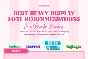
Best Heavy Display Font Recommendations for a Powerful Branding
A heavy display font is a typeface with a bold, strong character that instantly attracts attention. Designers commonly use this font for main visual elements because it creates a bold, strong, and distinctive impression in a design. Besides, its dominant shape helps increase visibility and strengthen the message.
Selecting the best heavy display font is crucial for creating an effective and professional visual. Every heavy display font has different qualities, so designers need to consider certain aspects, including readability, proportion, and suitability to the design concept. Hence, the understanding of heavy display font characteristics becomes an important process before using it in a design project.
This article will provide you with the best heavy display font recommendations for reference. It allows designers to choose fonts based on their visual strength, readability, and flexibility for various design needs. That way designers can create a more optimal and professional design appearance.
Table of Contents
Holter

Find the demo font: HERE
This font is one of the best heavy display font recommendations, standing out through its bold, solid characters. It features a distinctive rounded shape with a playful touch, along with outlines that enhance its visual impact. This combination creates a friendly yet strong and striking appearance. Holter is ideal for poster designs, product packaging, main visual titles, and branding needs that require high appeal and easy recognition.
Ranhart
Find the demo font: HERE
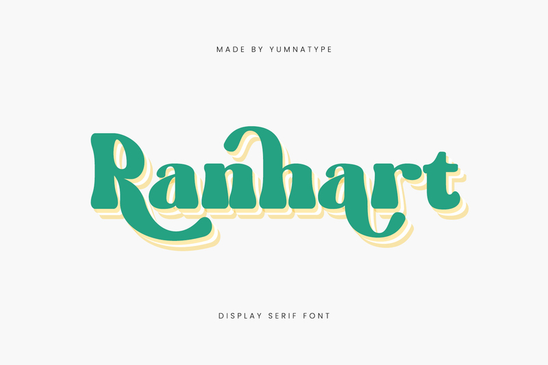
As one of the best heavy display font recommendations, Ranhart presents bold letter characters with a touch of elegant and decorative serifs. This font has a distinct characteristic in its gentle curve and its dynamic tips’ detail, creating a classic yet expressive feel. The combination of solid form and ornamental style makes it stand out. That’s why Ranhart is perfect for poster design, branding, product packaging, and the main visual element that needs a strong character in a design.
Roles Boys
Find the demo font: HERE
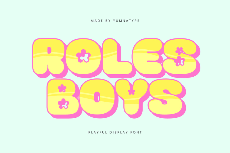
Among the best heavy display font recommendations, Roles Boys emphasizes a strong and eye-catching visual. It stands out through its bold, rounded, and full letterforms, creating a friendly yet expressive impression. The font’s uniqueness lies in its decorative floral ornaments, strengthening its playful feel. Therefore, it’s ideal for cheerful designs such as children’s posters, sweet food packaging, and any visual element requiring a unique and striking character.
Krapfen
Find the demo font: HERE
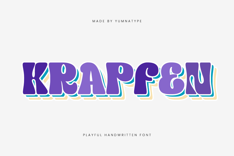
In the best heavy display font category, Krapfen conveys an organic feel through its relaxed, natural-looking letterforms. The varying curves of each character create a dynamic visual rhythm, making the display appear more lively and expressive. This distinctive characteristic creates a relaxed yet visually powerful impression. The solid letter proportions also maintain a secure readability. This font is suitable for music festival posters, creative product packaging, and playful designs.
Never Come
Find the demo font: HERE
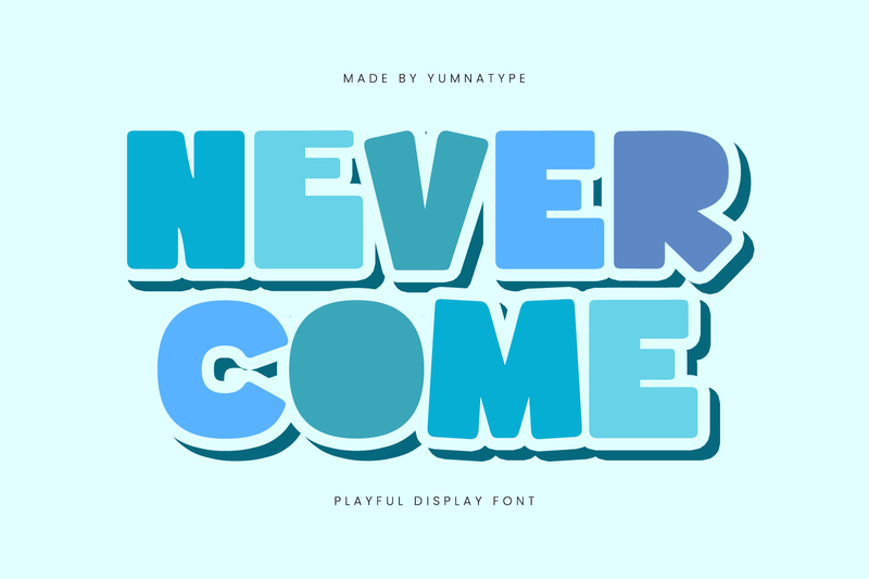
Never Come is a display font that offers a balance between aesthetics and strength. This font features a bold letter character with a solid structure and a wide opening, ensuring clear legibility at various sizes. Its distinctive features include rounded corners and variations in letterforms, creating a dynamic visual rhythm. Hence, this font conveys a strong, modern feel, making it suitable for posters, branding, packaging, and key visual elements.
Overlooks
Find the demo font: HERE
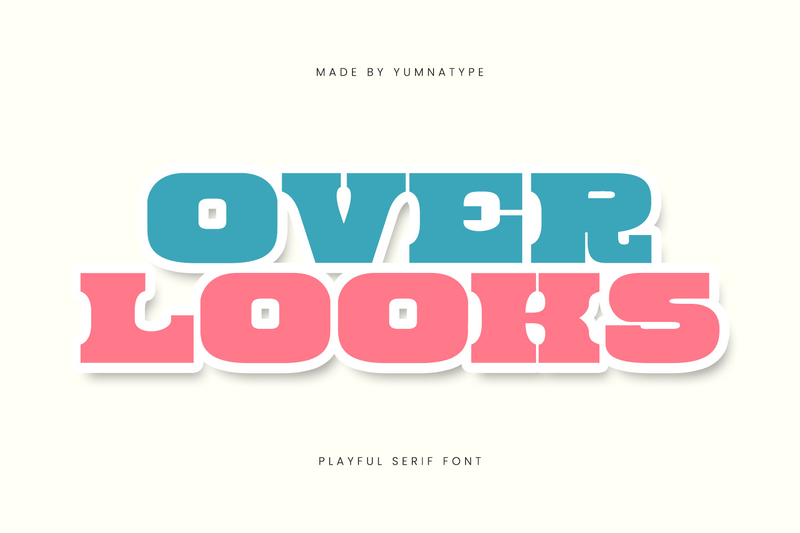
Overlooks conveys a sturdy letterform with a dominant weight and bold structure. The uniqueness of this font lies in its rounded sides of the letters and decorative accents that provide an expressive touch without disturbing readability. Its visual character exudes a bold, modern, and dynamic style. Therefore, it can support branding needs that require strong visual appeal.
Bullsnite
Find the demo font: HERE
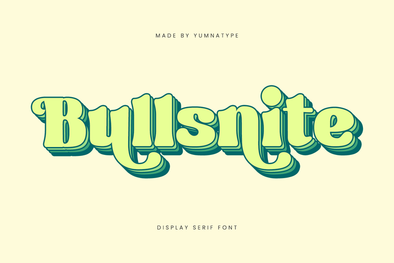
Bullsnite is a part of the best heavy display font recommendations, featuring bold letterforms with elegant and dynamic characters. Its uniqueness lies in the rounded serif details and flowing curves, creating a classic feel that still feels expressive. Its visual appearance conveys a playful impression without losing its solid and recognizable letter structure. Therefore, Bullsnite is perfect for headlines, posters, and branding designs that require high visual appeal and a striking appearance.
Pinkish Fruits
Find the demo font: HERE
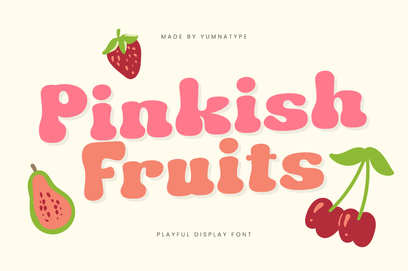
Pinkish Fruits is on the list of the best heavy display font recommendations, thanks to its unique and expressive design, presenting a bold, rounded letterform. Its naturally gentle corners and curves create a sweet, playful, and eye-catching impression. This font is characterized by its large letter proportions and a visual appearance that remains light despite its bold structure. Therefore, this font is suitable for creative designs that want to appear cheerful, fresh, and more visually prominent.
Foury
Find the demo font: HERE
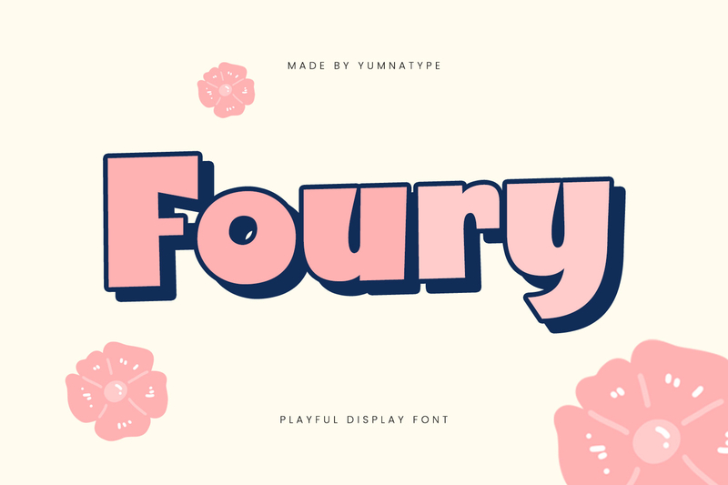
Foury becomes one of the best heavy display font styles that can attract attention through its playful and modern characters. Its distinct characteristic lies in its bold, a bit rounded, and big-proportioned letterform that makes the visual dimension more lively. The font’s look conveys a cheerful, friendly, yet strong impression in various design compositions. With an expressive and recognizable character, Foury is ideal for headlines, posters, branding, and creative designs seeking a more attractive look.
Marking Passion
Find the demo font: HERE
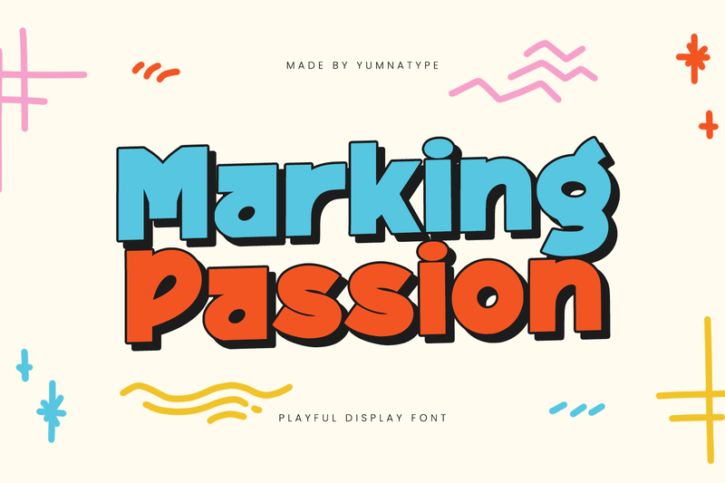
Marking Passion conveys a bold, cheerful, and energetic impression through its bold letterforms with a dense, recognizable structure. Its main characteristics lie in its rounded corners, large proportions, and playful lettering style, creating an expressive yet comfortable look. Its uniqueness makes this font feel modern and communicative in various visual compositions. As the best heavy display font, Marking Passion is perfect for creative designs that want to appear striking, dynamic, and more lively.
Nice Twins
Find the demo font: HERE
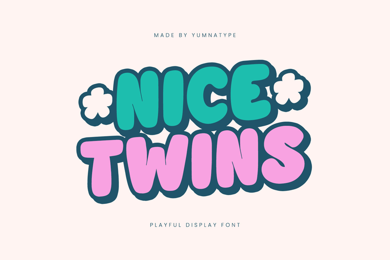
Among the best heavy display font recommendations, Nice Twins features bold characters with wide shapes and a solid structure. Its uniqueness lies in the rounded corners and gentle curves, creating a modern, friendly, and relaxed impression. Its consistent letter proportions maintain clarity and readability despite its dominant thickness. Nice Twins is suitable for YouTube thumbnails, promotional banners, apparel designs, and social media content that require an eye-catching appearance.
The Dormes
Find the demo font: HERE
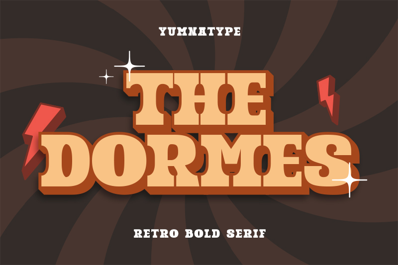
The final choice on our list of the best heavy display font recommendations, The Dormes, features bold, elegant, and authoritative letterforms. This font has retro-style serifs, with sharp angles and curved details that visually enhance the classic feel. Its dense, full-bodied letterforms create a strong, attention-grabbing appearance. This character makes The Dormes ideal for premium branding, vintage posters, and visual designs that aim to convey a luxurious and classy feel.
Conclusion
Overall, choosing the best heavy display font can help create a stronger, more engaging, and more recognizable visual appearance. Each font in this recommendation has its own distinct character and uniqueness, adapting it to suit all design needs, from branding to promotional media.
It’s important to choose a font that’s not only visually appealing but also optimally reinforces the design’s identity and message. Explore the unique characteristics of each of Yumnatype’s best heavy display font styles to create a more distinctive design for your project.