Why Heavy Display Font Styles Are So Popular
In the world of graphic design, designers increasingly use a heavy display font in various visual works. Font selection is not only about aesthetics but also plays a crucial role in effectively conveying a message to the audience. Each font type has a distinct character and function, so its use must be tailored to the design’s needs.
Along with the development of modern design trends, the use of heavy fonts has seen a significant increase. This reflects the need for visual displays that can attract attention and convey a message quickly. In this context, designs are required to not only be visually appealing but also capable of communicating effectively.
Furthermore, font selection plays a crucial role in visual communication. A heavy display font can help clarify information while also lending a bold and distinctive impression to a design. This article will discuss the reasons behind the popularity of heavy display font styles and how to use them appropriately.
Table of Contents
- 1 What is a Heavy Display Font?
- 2 The Characteristics of a Heavy Display Font
- 3 Why is the Heavy Display Font So Popular?
- 4 Benefits of Heavy Fonts in Design
- 5 The Advantages and Disadvantages in using Heavy Fonts
- 6 Tips in Using Heavy Fonts for Professional Use
- 7 Common Mistakes in Heavy Font Use
- 8 When to Appropriately Use Heavy Fonts?
- 9 Conclusion
What is a Heavy Display Font?
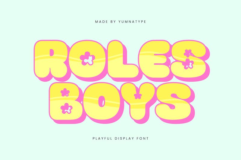
A heavy display font is a typeface with a dominant line thickness, making it more striking than other fonts. This type of font falls into the display category and is generally used for titles or main elements in a design, rather than for long text. This is because its bold shape is more effective at attracting attention than using it in paragraphs. This type of font is used in areas that require emphasis to ensure the main message is clearly visible and easily understood.
The Characteristics of a Heavy Display Font
The heavy display font has distinct characteristics that distinguish it from other font types. Their primary characteristic is the dominant line thickness, making them stand out in designs. Furthermore, the letterforms tend to be compact with relatively tight spacing, creating a bold impression. These fonts are designed for large sizes due to their bold design, making them more effective for attracting attention than for long text.
Why is the Heavy Display Font So Popular?
Many designers use a heavy display font because of its function and visual appeal. This font is not only visually appealing but also helps convey messages more clearly. Here are some of the main reasons why designers widely use this font:
Attracting Attention
A heavy display font is bold and striking, making it more appealing to the audience. In design, such clarity is critical to making sure key messages are quickly visible.
Looking Strong and Firm
Bold fonts create a strong and bold visual impact. This helps the design appear bolder and have a clear identity.
Suitable for Digital Content
In a digital world, a design should compete with other content. This font type helps the main elements look clear even in a brief glance. Therefore, your design will be more recognizable.
Creating a Clearer Text
Using this font in crucial parts, such as titles, helps differentiate the main information from other text. Hence, it makes the design structure more understandable.
Applicable to Various Style
Various design concepts, like modern, minimalist, or retro, can use this font type. This flexibility makes it more applicable to diverse visual needs.
Benefits of Heavy Fonts in Design

In design, it’s essential to direct the audience’s attention on key elements to communicate the message effectively. A heavy display font serves to highlight key elements in a design, such as titles or headlines, making them more easily visible to the audience. With their striking appearance, these fonts help direct attention to the most important information.
Additionally, the use of a heavy display font also plays a role in establishing a visual hierarchy, making the design structure more organized and easier to understand. This font type helps differentiate between primary and supporting elements, enabling a more effective message delivery.
The Advantages and Disadvantages in using Heavy Fonts
Every font type has its advantages and disadvantages, including heavy fonts. Understanding these is important so that their use is not only visually appealing but also comfortable and effective in conveying a message.
- Advantages
It has a striking appearance that quickly attracts attention. Its bold characters also create a strong and assertive impression, making it suitable for strengthening visual identity. Furthermore, this font is effective for highlighting important elements such as taglines, calls to action, or promotional information, making them more easily recognized.
- Disadvantages
On the other hand, heavy fonts are less suitable for long texts because they can reduce reading comfort. Their bold shapes can also make a design appear cluttered if not arranged properly. Therefore, combining them with other elements is necessary to maintain balance.
Tips in Using Heavy Fonts for Professional Use

While heavy fonts have a powerful appearance, improper use can make designs appear crowded and difficult to read. Therefore, some consideration is necessary when using them.
- Use for Important Parts
Use this type of font in the parts you want to emphasize to direct the audience’s attention to those elements.
- Combine with a Light Font
Combine a lighter font to create a visual contrast and maintain the look’s harmony.
- Pay Attention to the Spacing
Manage the space between lines and text so that it doesn’t look too crowded. Thus, it makes the visual neat and comfortable to see.
- Avoid Excessive Use
Excessive use can make the design lose its focus because all of the elements look dominant.
- Utilize White Space
White space helps create a more spacious look to emphasize the main elements.
Common Mistakes in Heavy Font Use
Using this type of font often leads to errors if not carefully considered. The most common mistake is overusing it on almost every element, making the design look crowded and losing focus.
Furthermore, using it on long text and with improper letter spacing can make the appearance feel too crowded. To maintain balance and direction in the design, it is essential to use it proportionally.
When to Appropriately Use Heavy Fonts?
Using a heavy display font should be adjusted to the design’s goals and characters. This type of font is suitable for emphasizing visuals when building a firm and brave impression. Additionally, this font is also effective when the design requires high appeal. As a result, the design immediately draws attention to the main part while maintaining visual balance.
Conclusion
A heavy display font plays a crucial role in creating a distinctive and visually appealing design. An adjusted usage of the goals and compositions is necessary to make the visual balanced and not excessive. With understanding the characteristics and limitations, designers can place the font accurately on the elements that need visual emphasis.
Through this understanding, you can start applying this heavy display font across various design needs. Explore the font combination and element placement to create a more direct and professional look.