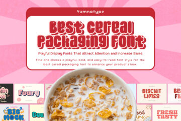
Best Cereal Packaging Font: Playful Display Fonts That Attract Attention and Increase Sales
In a cereal packaging design, visuals are important to attract the audience’s attention amidst colorful shelves and product competition. Cereal products must attract attention quickly, and this is where font selection becomes crucial. The right use of cereal packaging font is for both aesthetic and attention-grabbing purposes.
Cereal packaging font is a visual strategy to build brand character, increase readability, and influence purchasing decisions. As the first element seen, the font should convey a clear message, effectively conveying a fun, premium, and family-friendly impression. Bold, clear, and characterful fonts will help products become more recognizable and memorable while also appearing more visually appealing and professional.
With the right selection of fonts, you strengthen a brand’s identity and increase the overall product’s appeal. A characterized design can create a delicious feel, even before someone tries the product. Now is the time to optimize your design with a standout and valuable cereal packaging font. Through this article, find the best font style to create a more attractive and memorable cereal packaging. Ready to increase your product competitiveness and sales? Read now!
Table of Contents
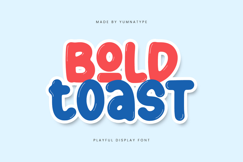
Bold Toast
You can also find the font here
Bold Toast is the first recommendation for cereal packaging font, featuring a display-style font with playful, bold, and rounded bubble shapes. Having a strong stroke, this font enhances visual appeal and instantly captures attention. Its consistent letterforms make designs stand out on cereal packaging and posters. This font is ideal for creating standout, memorable designs and effectively enhances product shelf appeal.
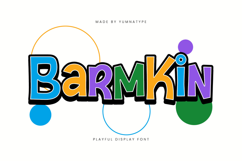
Barmkin
You can also find the font here
Striking with a playful character, Barmkin combines square letter structures and sharp angles to create a strong, dynamic, and modern impression. With a solid stroke, thickness, and low contrast, this font remains clean, stable, and highly legible at various sizes. This combination makes Barmkin ideal as a cereal packaging font that is fun, energetic, and bold.
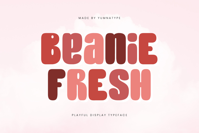
Beanie Fresh
You can also find the font here
Beanie Fresh is a unique display font with a cheerful and friendly nuance, due to its rounded, gentle, and fun letterform. This font has a bold and low-contrast letterform, creating a strong yet pleasing look. Meanwhile, its larger-than-usual counter proportions give it a distinctive characteristic.
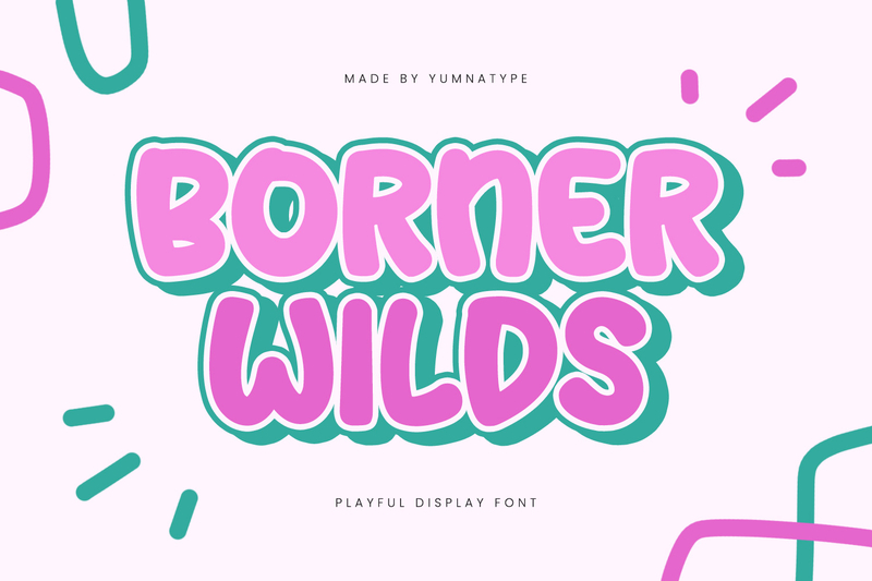
Borner Wilds
You can also find the font here
Delivering a strong and modern visual character, Borner Wilds is a bold and playful all-caps display font. This font features bold letters with low contrast and consistent proportions. This combination creates a balanced, readable, and highly appealing look suitable for various design needs such as cereal packaging, posters, cereal product branding, and logos with a striking, energetic, and attention-grabbing font style.
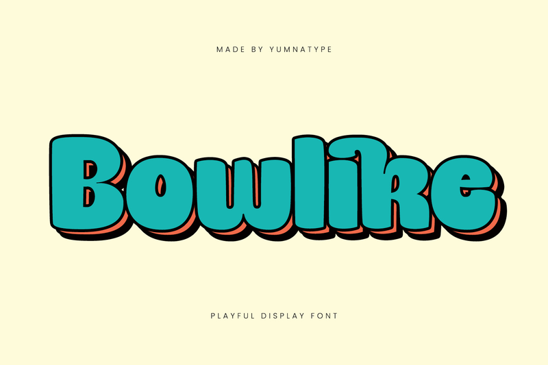
Bowlike
You can also find the font here
Bowlike is a display font that presents a playful feel in every design. It has cheerful and expressive visual characters with a bold and low-contrast letterform, giving a strong and lively look. One of the advantages is its ligatures, which make the letter combination look unified, dynamic, and unique. Therefore, its features increase the typography’s aesthetic value. Bowlike is ideal for a cereal packaging font and for branding and posters with a fun, energetic, and characterized impression.
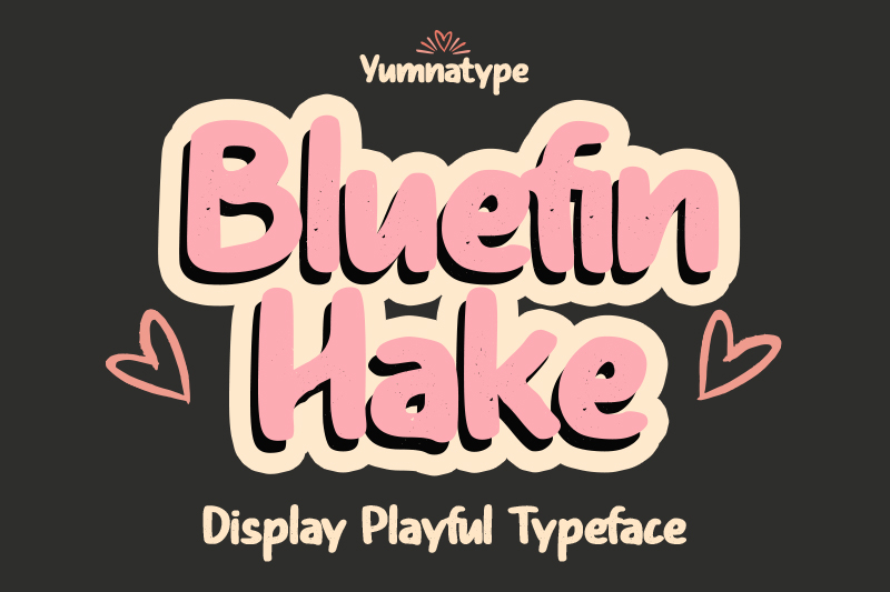
Bluefin Hake
You can also find the font here
Bluefin Hake is a unique display font with a playful and creative feel, perfect for various design needs that aim to stand out and convey character. With its bold, low-contrast letterforms and subtle grunge details, this font remains clearly legible while adding an attractive artistic touch. Bluefin Hake is a perfect choice for cereal packaging designs and other design needs, such as posters and branding, that require a fresh, expressive, and memorable look.
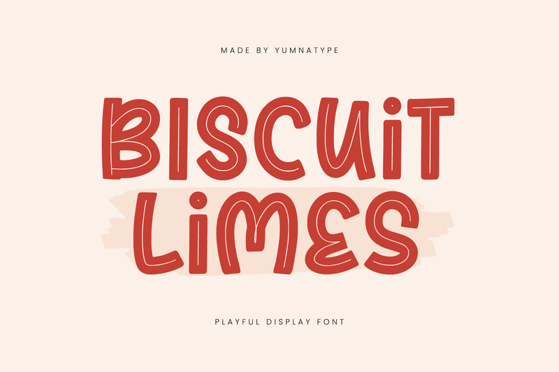
Biscuit Limes
Link of font demo: Click Here
Featuring a whimsical style full of character, Biscuit Limes is a display font that can create a playful yet eye-catching impression in various design projects. With its bold and varied letterforms, this font creates a dynamic and unique visual rhythm. Aside from being an ideal cereal packaging font, Biscuit Limes works well for packaging design, posters, branding, and digital content, offering a fresh and expressive appearance.
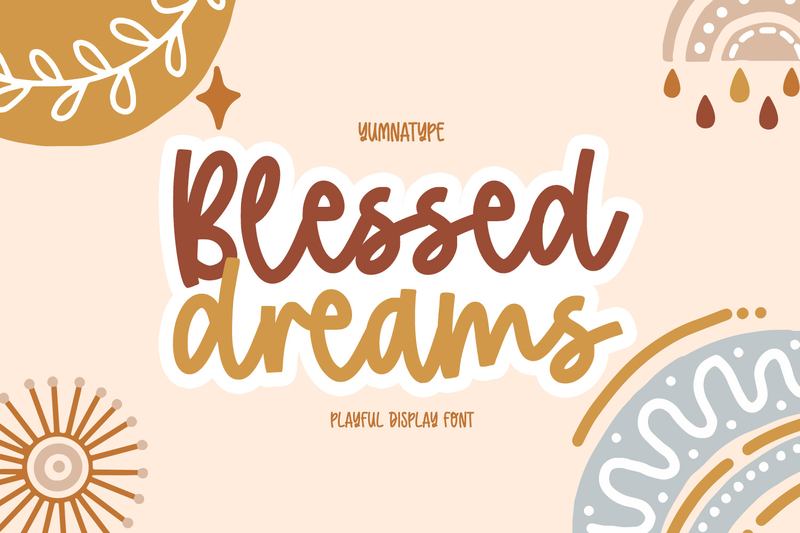
Blessed Dreams
Link of font demo: Click Here
Blessed Dreams is a display font that has an attractive look with gentle nuance. It has a soft stroke with a script style. Each letter is connected like a cursive style with a balanced proportion, maintaining its clarity even though it uses a script style. This font is suitable as a cereal packaging font for cheerful, attractive, and recognizable cereal packaging. Furthermore, Blessed Dreams also has a clipart bonus that adds visual value in every design project.
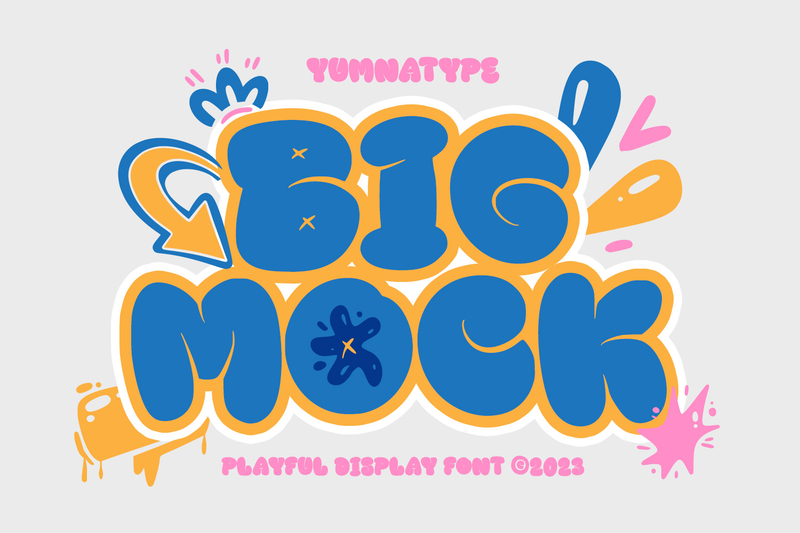
Big Mock
Link of font demo: Click Here
Big Mock is an all-caps display font with a playful, unique character that stands out and instantly attracts attention. This font has a thick letterform, making it suitable to create a bold and dominant look. With uniform letter proportion, low contrast, and ligature support, some letter combinations look more unified and aesthetic. Big Mock is perfect for a cereal packaging font for children’s cereal packaging, product promotion posters, and snack branding.
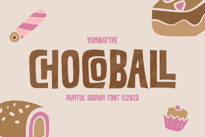
Chocoball
Link of font demo: Click Here
Emphasizing the firm, attractive, and unique impression, Chocoball is an uppercase display font with a playful and modern concept. With its asymmetrical box-shaped letters, this font makes the text look more unique and prominent. This makes it the right selection for a fun, attractive, and recognizable cereal packaging font. Moreover, it features ligatures that unify letter combinations harmoniously. Therefore, this font creates a dynamic and playful visual rhythm. Additionally, it gives bonus clipart that enriches the design, making it suitable for use with large text to maintain aesthetics, consistency, and readability.
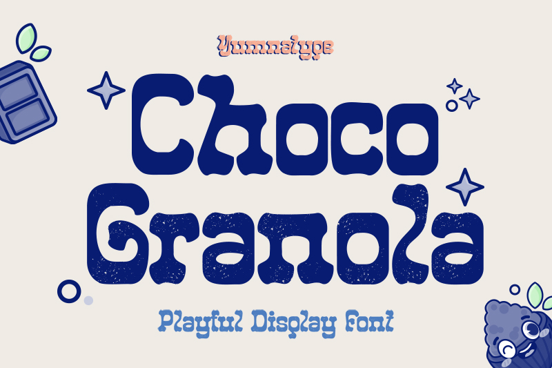
Choco Granola
You can also find the font here
Exuding a sweet and playful vibe, Choco Granola comes with a whimsical touch that makes the design feel more lively and attractive. Each letter is designed with a soft, square base shape, resulting in a neat and attractive, playful impression. Some letter shapes on the baseline are irregular, adding a unique and relaxed variation to the letters. This font is equipped with ligatures for smooth letter transitions, while stylistic sets add expressive variations to make the text look harmonious, aesthetic, and flexible.
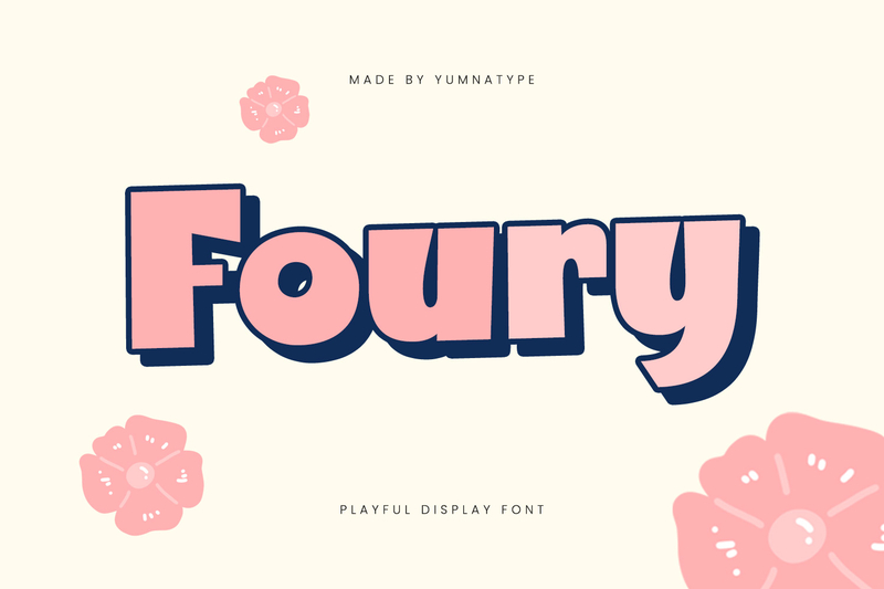
Foury
You can also find the font here
Presenting a brave and charming impression, Foury comes as a playful display font with strong and very bold letters. The geometric shape features a solid and playful look, making it an eye-catching cereal packaging font. Featuring basic ligatures that enhance the letter combination, this font offers a bold, professional, consistent, and easily recognizable look.
Fresh Tasty
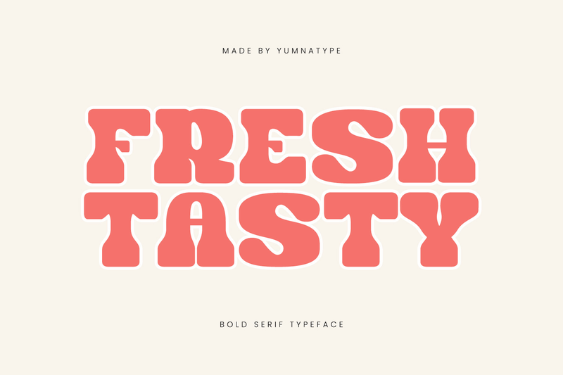
Link of font demo: Click Here
As the classy last touch, Fresh Tasty presents as a bold and dynamic serif font with a modern style. It exudes a fresh energy in every design using this font. Its character stands out through rounded curves and soft, thick terminals, combined with rounded serif details. Moreover, it creates an organic and natural feel. The stable proportions of the letters create a premium yet calming feel. As a result, Fresh Tasty is ideal for cereal packaging that seeks to create an attractive, warm, and trustworthy impression on consumers.
Conclusion
The selection of a cereal packaging font isn’t only about aesthetic but also an important visual strategy to win consumers’ attention and strengthen a brand identity. The perfect font can convey fun, energetic, premium product characters and also increase consumer appeal.
With the combination of bold, playful, and characterized styles, the use of the right cereal packaging font can make your design look standout and memorable. As a result, it can drive consumers’ purchasing decisions effectively.
Now, it’s time for you to decide! Choose the best cereal packaging font and create a charming packaging design. Make your product the center of attention on every shelf and excel over competitors.

