Font for Baby Products: 16 Top Recommendations to Enhance Your Branding
In the industry of baby skincare, the visual of packaging has an important role in building a sense of safety and trust among parents. Attractive packaging comes from appealing design elements, and one of the examples is typography. The right typography can deliver a soft and clean character that is relatable to baby skincare products, like using a font for baby products, for example. The letterforms, thickness, and proportions of typography can influence customers’ perceptions of the product’s quality and safety.
Inappropriate font selection can cause packaging to fail in reflecting the brand’s intended values, which should appear child-friendly, otherwise look the opposite. As a result, it needs a font with a sweet, soft, and playful character that helps a baby brand product look more friendly and full of gentleness. Keep in mind that designers need to understand that fonts are not only a decorative element but also an important aspect of visual brand strategy.
Through this article, you will find the best font for baby products that are not only visually adorable but also functional and consistent for various kids-themed designs. Those fonts are suitable for packaging, labels, and baby product promotional materials to strengthen brand image and support selling value.
Table of Contents
Milk Water
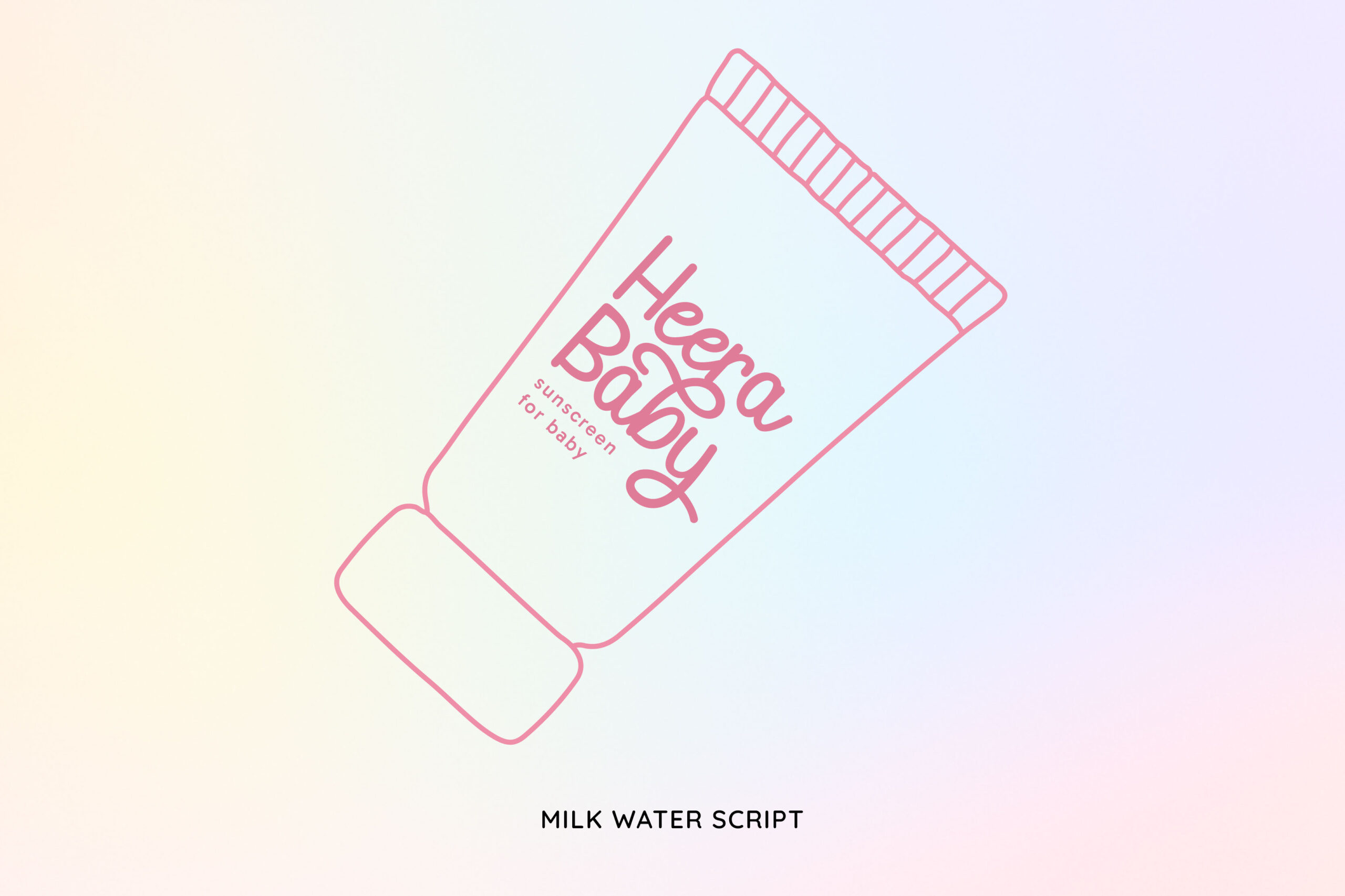
Milk Water has a soft, friendly, and calming typography character with curved letterforms and smooth letter flow. Its visual style creates a warm and natural impression, making it an ideal font for baby products.
The uniqueness lies in its cuteness yet neatness and readable look, making it ideal for packaging designs. In the industry of baby skincare, this font can strengthen a neat brand image and help build emotional closeness with the parents as the main customer target.
Silky Daisy

A font with a handwritten style, Silky Daisy provides a calming typography character through the soft and curved letter flow. The visual look presents a warm and attentive impression, suitable for the design needs of baby products. For brands that want to emphasize a safe and friendly vibe to customers, this font for baby products can be the right choice. The balance between aesthetics and readability makes Silky Daisy effective for a variety of design media, printed or digital.
Vine Spinach
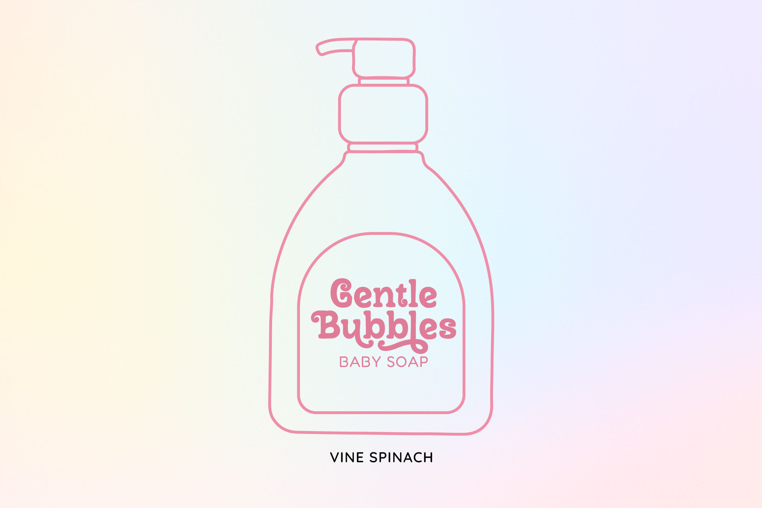
The cheerful impression becomes the main identity of this font. The decorative letterform is soft with an additional smooth curve, creating a playful character without being overdone. This characteristic makes Vine Spinach feel friendly and easily acceptable, specifically for the baby product designs.
As a font for baby products, Vine Spinach, can attract attention and maintain a safe impression. For baby products, this font is ideal for titles or visual emphasis to strengthen the brand identity that is cheerful, clean, and recognizable.
Biscuit Limes

Next, we have Biscuit Limes, a display font that presents a cheerful, attractive visual character through its bold letterforms and curved corners. The visual look gives a friendly and favorable impression without an overdone appearance, making it more easily accepted.
The uniqueness of Biscuit Limes lies in the expressive yet neat display style, making it suitable as a font for baby products. Therefore, this font works perfectly as product titles and variant names. Besides, it is suitable to be a visual emphasis element that requires strong appeal while maintaining a safe, clean, and trustworthy impression.
Poppy Spoor

The Poppy Spoor font features a cheerful and dynamic typographic character through bold letterforms with varied and free-flowing proportions. The varying heights and widths of the letters create a lively visual rhythm without compromising readability. The subtle curves of each character eliminate any sharpness, giving the font a safe and friendly feel.
Another uniqueness lies in the restrained playfulness, preventing Poppy Spoor from appearing overdone or overly decorative. As a font for baby products, this character effectively creates a warm and welcoming atmosphere.
Bluefin Hake

Bluefin Hake is a display font with a soft, rounded, and playful visual character. Its smooth, angular letterforms and plump proportions create a friendly and calming visual appearance, making it suitable for baby products.
In the context of modern baby products, this font is attractive from the first glance when combined with the right packaging design. Bluefin Hake is effective in logos, product names, and main packaging headlines, conveying a caring, comfortable, and safe image for babies.
Sunday Flicker
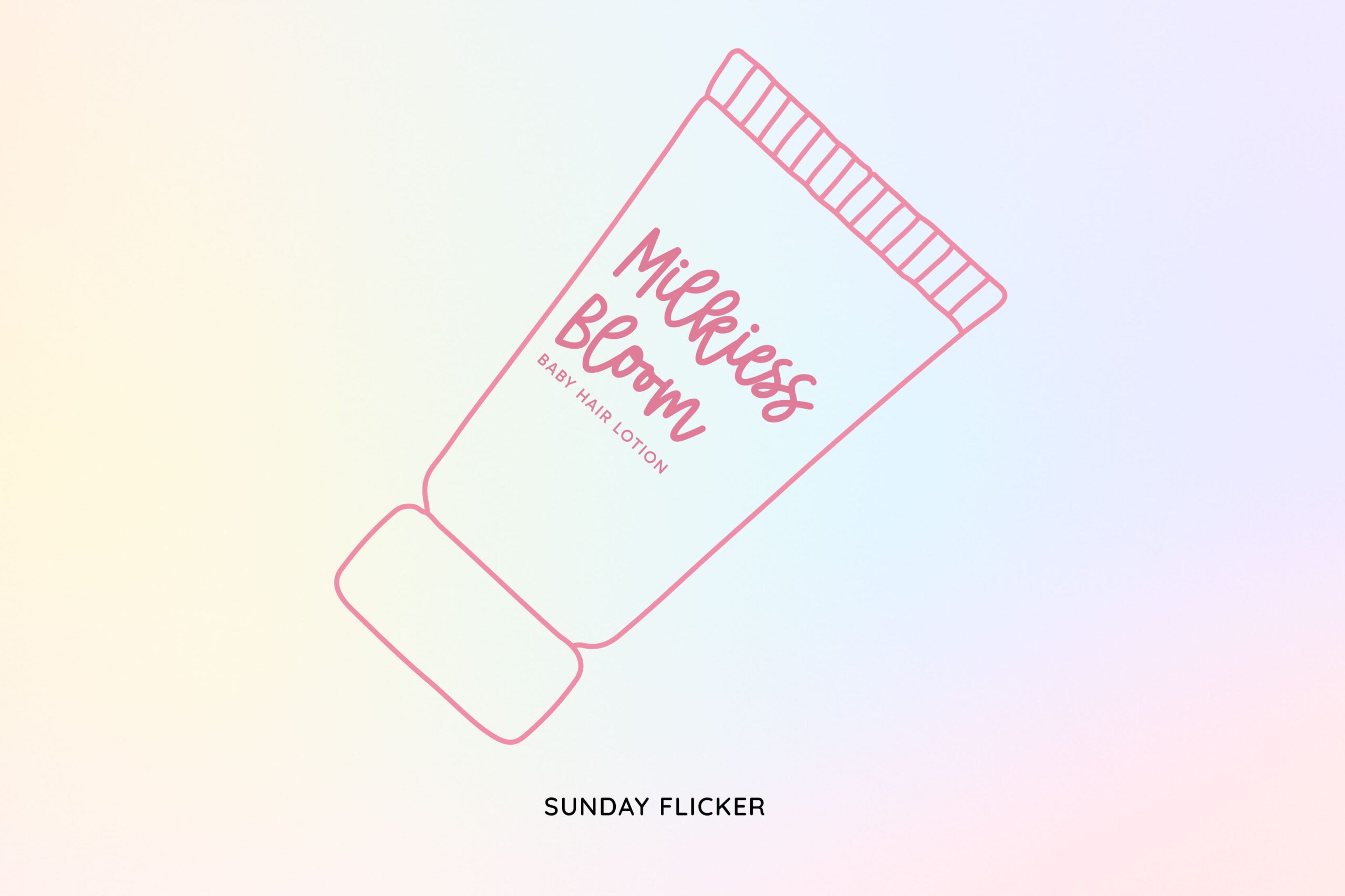
The cheerful nuance becomes the main characteristic of Sunday Flicker, evident in its rounded, balanced letterforms. This font displays a cheerful character through its bold lettering and flowing handwriting. Its uniqueness lies in the harmonious blend of display style and adorable handwritten touches.
In the context of a font for baby products, those characteristics can build a sense of security without being overly adorable. Sunday Flicker can serve as a visual bridge between the product’s softness and parental trust.
Walnut Cream

Designed for creating a calming feeling, Walnut Cream presents as a font duo that combines two different typography style that complement each other. The subtle handwriting style gives a personal and warm touch, while the letter companion’s simple and neat style works to maintain readability. The light letter flow with a smooth curve creates a visual rhythm that is pleasing to the eyes.
As a font for baby products, this font’s character builds a sense of security and trust visually. Walnut Cream supports a natural, soft, and attentive brand image, especially in the implementation of packaging design.
First Marigold
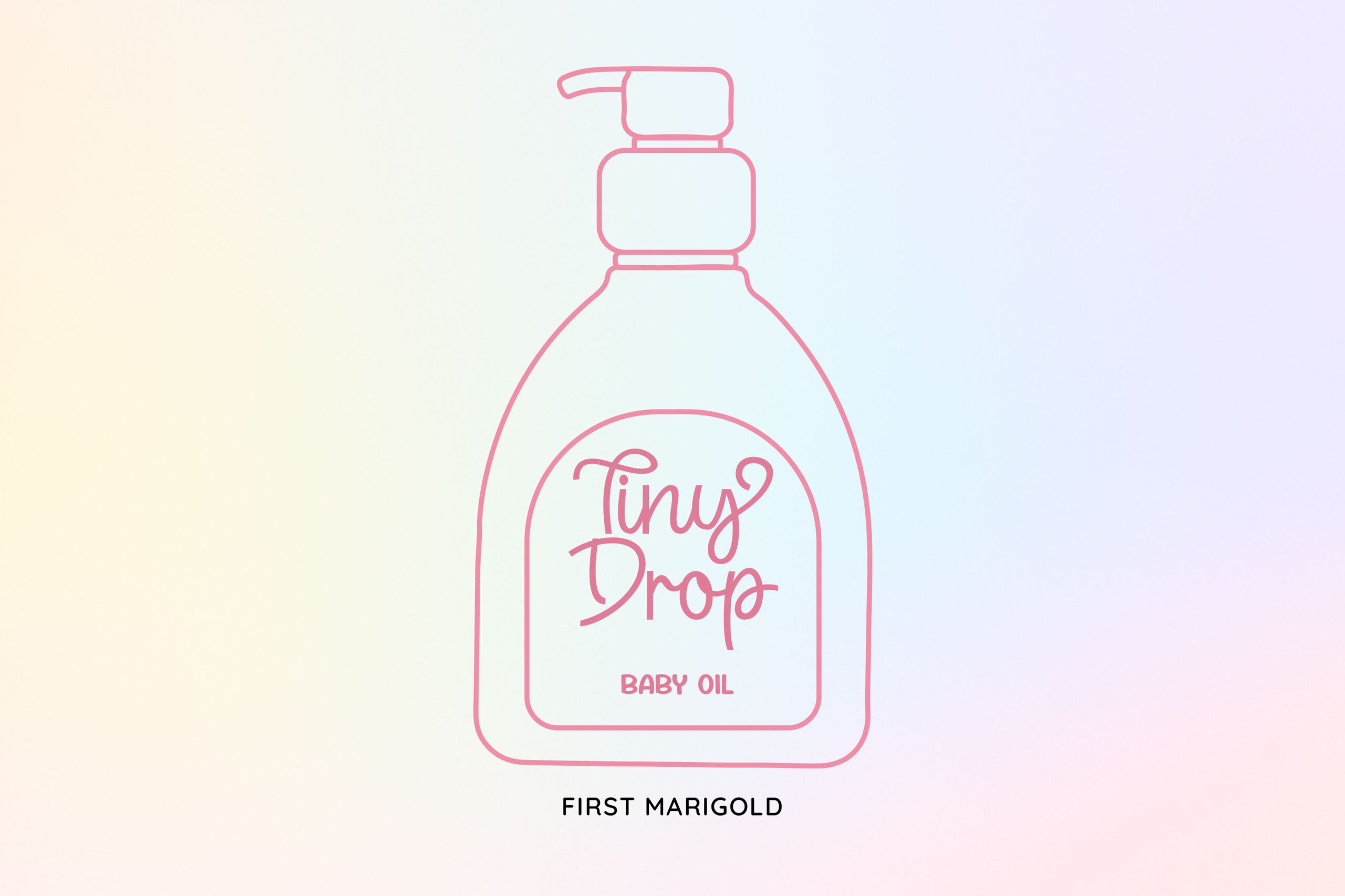
Rather than emphasizing a single font style, First Marigold builds visual character through a combination of complementary typefaces. Soft script accents provide a warm, emotional touch, while bold display fonts serve as clear structural elements. The combination of these two styles creates a friendly and recognizable look, giving a personal vibe without compromising readability.
First Marigold can convey a balanced sense of security and cheerfulness. As a font for baby products, this font is effective in strengthening a soft, attentive, and trustworthy brand identity from the first glance.
Trailing Down

A visual freshness becomes the main strength of Trailing Down, as reflected in each of its letters that has a cheerful rhythm and natural flow. The varied and artistic letterforms with soft angles create a dynamic feel, as if each character moves to a pleasing rhythm. This visual approach makes Trailing Down instantly recognizable and creates emotional appeal from first glance.
The distinction of this font lies in its ability to be expressive without ignoring its main function as a visual communication tool. As a font for baby products, Trailing Down provides a safe, friendly, and comfortable playing atmosphere.
Great Bucket

Great Bucket boldly attracts attention with its thick, smooth, and curved letterforms. Each character has a simple, yet expressive structure, making it easier to recognize and giving it a visual appeal for customers.
This font’s distinction lies in its playful, stable impression, yet not overly exaggerated, making it comfortable to read as a display font. In the baby product industry, the Great Bucket character creates a pleasant atmosphere while fostering trust in the product’s quality.
Cute Oneself
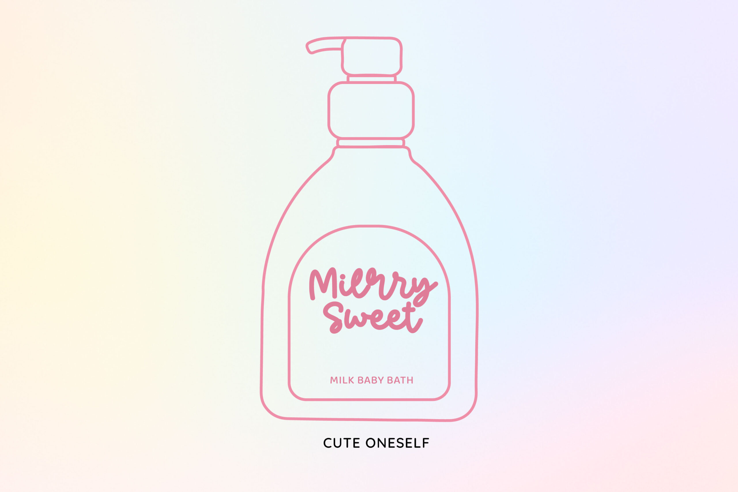
As a font that represents a children’s world that is cheerful and full of love, Cute Oneself provides a soft handwritten letter character. This font has an expressive character through a Latin letterform with smooth curves and natural flow. The angular letter creates a sense of security and a friendly impression, suitable as a font for baby products.
In the context of baby products, Cute Oneself can build an emotional closure, as well as attract attention at first sight. This font is ideal for logos, product names, and main headlines on baby product packaging because it can strengthen an image that supports product perception and creates a sense of security and comfort.
Windbill
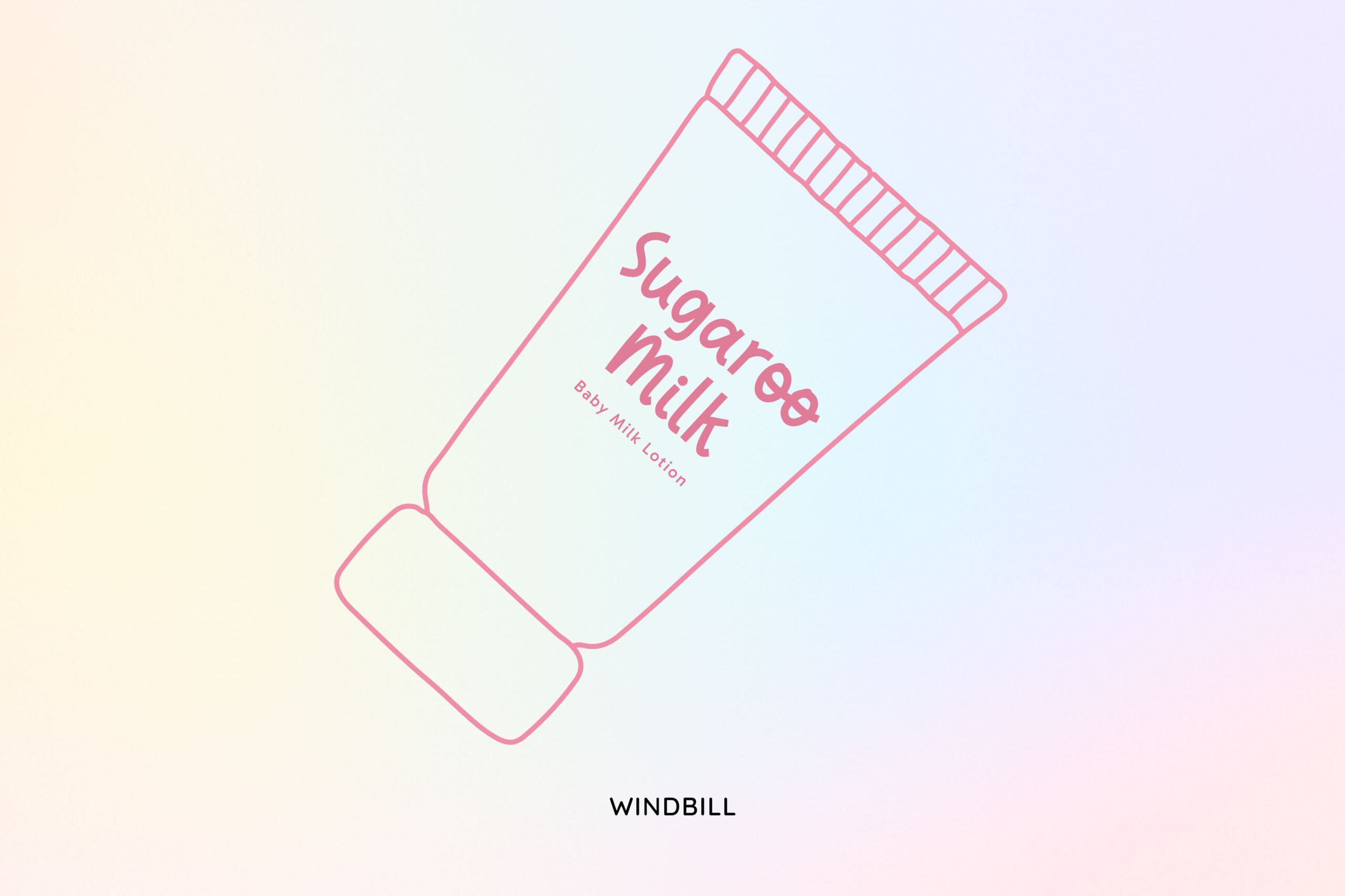
Next, Windbill is a handwritten font with a soft and clean visual character. Its rounded letterforms with simple, steady strokes create a light, calm, and eye-catching impression. Windbill’s uniqueness lies in its neat and consistent handwriting style, creating a natural feel without appearing too much or being overly decorative. This character makes Windbill visually friendly and calming. In the implementation, this font remains easy to read at various sizes and media, making it suitable for both personal and professional branding needs.
This font has a good readability level at various sizes, making it effective for both primary and supporting design elements. Overall, Windbill represents a suitable font for baby products, showcasing visual simplicity with a warm, personal touch.
Craving Falafel

Craving Falafel is a monoline script font with a soft, flowing, and expressive visual character. Its letterforms and consistent line thickness create a light, neat, and eye-catching appearance. Its simple and friendly feel makes Craving Falafel a unique script style, thus creating a personal yet modern impression. This visual character qualifies it as a font for baby products, as it exudes a sense of security, friendliness, and visual delight.
Weigher

In visual communication, especially for baby products, personal touch is crucial. Weigher addresses this need through its soft, flowing handwritten script. The expressive yet controlled strokes create a warm, friendly, and caring impression. The smooth, angular letterforms promote a safe and calming visual perception, making it suitable to use as a font for baby products. Furthermore, its excellent readability makes Weigher suitable for use on packaging, labels, and visual identity elements that emphasize emotional connection with parents.
Weigher is effective as a primary typographic element on product packaging because it creates a soft, clean, and calming visual appearance. The flowing lettering helps create a sense of security and friendliness, thus enhancing the perception of baby care products.
Conclusion—Font as The Representation of Gentleness
The typography selection for baby products is related to the aesthetic aspect and becomes an important factor in the visual communication strategy of a brand. Through the discussion of the fifteen recommendations of a font for baby products, it can be concluded that typography selection plays a crucial role in the visual communication of baby products. Research has shown that soft, friendly, and easy-to-read fonts significantly contribute to building parental sense of security and trust in a brand.
Therefore, designers and brand owners should evaluate the use of typography in packaging, visual identities, and promotional materials of baby products more carefully. Selecting a font for baby products requires careful consideration of brand consistency and how audiences interpret the visual message, rather than solely focusing on aesthetics.

