Playful Logo Design: Real Case Studies from 6 Iconic and Beloved Global Brands
A logo is a vital part of any brand—it gives the brand its identity and face. Without a logo, a brand loses its face. A brand can utilize various logo types to bolster its image and express its unique personality. These types of logos include lettermark, wordmark, emblem logos, and others. Besides that, we can also categorize a logo based on its style, such as a modern, minimalist, vintage, or playful logo.
A playful logo, which continuously grows in popularity, is one of the most appealing styles to use as a brand identity. The playful style has a cheerful and lively design, and thus, playful logos often utilize vibrant colors, adorable icons, and lively fonts. This article will explore what a playful logo is and its characteristics by examining case studies from iconic, famous brands.
Table of Contents
What is a Playful Logo?
A playful logo is a logo designed with a visual approach that feels light, fun, and whimsical. The purpose of this logo is to evoke happiness and cheerful humor. Just like what has been previously mentioned, a playful logo commonly utilizes vibrant colors, unique typography, and adorable illustrations to create the vibe. In addition, the design of a playful logo aims to build a friendly, creative, and appealing image for a brand.
The Characteristic of Playful Logos
A playful logo stands out with its delightful and easygoing vibe, showcased through its choice of colors, typography, and shapes. Discover the essential traits that define a playful logo design below:
The use of vibrant and appealing colors
- Playful design uses vibrant colors like yellow, pink, light blue, neon green, or purple.
- The style often combines contrasting colors to create a fun and energetic vibe.
- Colors play an essential role in making the design look livelier.
The freedom of choosing the unique typography
- Playful logos often use handwritten, curvy, or weirdly shaped yet intriguing types of fonts.
- Sometimes, the logo uses modified shapes, including slanted typefaces, irregular sizes, or leaping fonts.
The choice of free, dynamic shapes
- The shape of a playful logo is sometimes asymmetrical and does not follow the rules.
- The design is flexible with moving, irregular elements that look playful.
- Sometimes, there are some additional elements like splashes, doodles, or irregular lines to add the visual characters.
The use of cheerful visual elements
- Playful logo designs sometimes feature charming icons or drawings, such as cartoon characters, amusing facial expressions, animal forms, or toys.
- The style often includes graphics that are simple, playful, yet unrealistic.
The Advantages of Using a Playful Logo
A playful logo is meticulously designed to give certain advantages to a brand, like the following:
Creating an emotional relationship
Using a playful logo can build an emotional relationship with the customers that favor humor, creativity, and fun.
Establishing a brand tone
A good logo can strengthen the brand’s image. For example, using a playful logo makes your brand look more friendly, creative, and intriguing.
Standing out in the crowd
In a crowded market, a playful logo helps brands break through the noise with a memorable and unique presence.
Case Studies of Iconic Global Brands
Lego
Lego stands out as a renowned toy manufacturer recognized worldwide. Lego features a playful logo that embodies fun, creativity, and a spirited energy, perfectly reflecting the brand’s identity and mission.
Established by Ole Kirk Christiansen in 1932 in Billund, Denmark, Lego was inspired by two Deutsch, or German, words, “leg godt,” which means “play well.” By the name itself, we can see that it aims to produce toys to play with. Originally, Lego only produced wooden toys, but over time, as technology developed, the company began manufacturing plastic cube toys that we can disassemble in any way we choose. It allows us to create unlimited imagination both for children and adults.
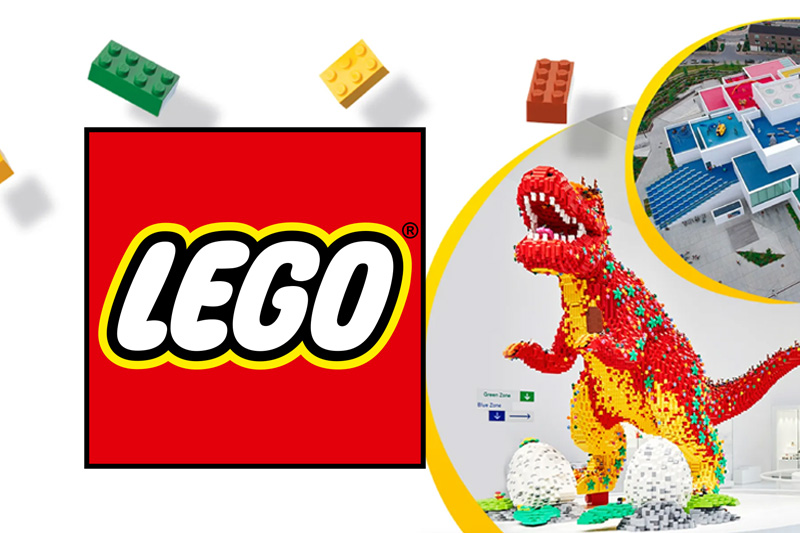
Lego’s logo features a light red background and a white, rounded, bold font with a yellow and black outline. The rounded typography radiates a warm, fun, and comfortable atmosphere, making it ideal for the target demographic of children and their families. The vibrant color scheme represents spirit, creativity, and enjoyment, making the playful logo stand out amid the crowd.
The logo stands out with remarkable consistency and recognizability, enhancing its branding power while effortlessly maintaining its vibrant appeal. The playful and creative design sets the logo as a standout among brands that effectively use a playful logo to represent their products and services.
Google is one of the best technology and service brands today; it uses a lettermark logo with playful colors. Google initially began as a search engine project called “BackRub” at Stanford in 1996. Then, in 1997, it began to evolve and was renamed Google, with its first colorful logo using a serif font.
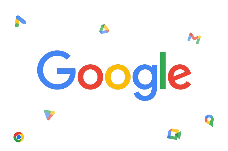
Google’s logo features four bold primary colors: blue, red, yellow, and green. Google’s color order conveys the impression that Google is not bound by rules and likes to experiment. We can see this in the letter “L,” where Google uses the color green, even though the previous colors were primary colors. This shows that Google enjoys playing with colors, which is a characteristic of playful design.
Another interesting aspect that showcases Google’s playful side is its habit of displaying interactive doodles or illustrations when commemorating certain days. Google often changes its logo version into specific interactive illustrations; for example, during Chinese holidays (Lunar New Year), it uses animal illustrations as symbols representing that year in Chinese beliefs.
Play-Doh
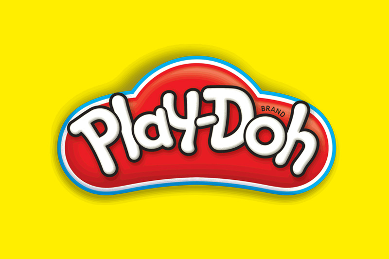
Play-Doh is a brand of soft, moldable modeling clay that encourages children to explore their creativity, imagination, and fine motor skills. First introduced in 1956, it has become a classic creative toy.
The Play-Doh logo features a playful design that reflects a whimsical style, characterized by bold, rounded typography that mimics the product’s soft, dough-like texture. This playful logo feels friendly and inviting—perfectly suited for its young audience.
Additionally, the Play-Doh logo uses vibrant colors like red, white, and bright yellow to appeal to children as their target audience. These colors are effective in giving off a sense of happiness, whimsy, and positivity.
Ultimately, while it experiences obvious changes at times, the Play-Doh logo consistently maintains its distinctive shape and whimsical charm. Play-Doh cleverly employs a playful logo that perfectly aligns with its brand identity, products, and target audience.
Toys “R” Us
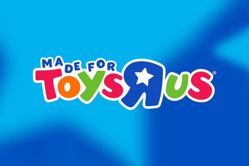
Toys R Us has a relaxing and colorful logo. We can see from the display that the Toys R Us logo is a playful logo. It is incredibly suitable for the toy industry as the look is appealing to children.
Toys R Us is a toy retail store that is globally renowned since its establishment in the 1940s. Charles Lazarus, the founder of the company, chose one of the most promising and prospective areas to start the business. And then in 1948, he opened Children’s Supermart, a furniture store for children, in Washington DC. Since then, the store has been continuously developing and innovating until its rebranding to Toys R Us that we know nowadays.
The Toys R Us logo utilizes vibrant colors to convey a cheerful, active, and pleasant vibe that is appropriate for children. The font choice is quirky and relaxed, since it employs a whimsical display font with nonuniform shapes and sizes, emitting a free and spontaneous spirit.
The “R” letter in the logo is purposely printed upside down to give the impression that it was created by a child. It has a very strong visual impact on understanding the world from a child’s perspective. Then, placing the star image inside the letter “R” gives a cheerful impression and makes it feel close to children. Star images are often used in the decoration of playrooms or children’s gardens, which will make the logo feel familiar and friendly to them.
Fanta
Fanta is a carbonated drink brand that delights with a range of lively and colorful flavors, perfect for the young and young-at-heart. Since its inception in 1940, the Fanta brand has been a proud member of the Coca-Cola family. Fanta has always embraced a fun logo, showcasing a striking, playful sans-serif display font with a touch of italics. The vibrant orange serves as the perfect representation of the iconic orange flavor variant, while the small green leaf icon adds a delightful touch. This combination creates a colorful logo that embodies a playful and cheerful style, radiating fun and excitement.
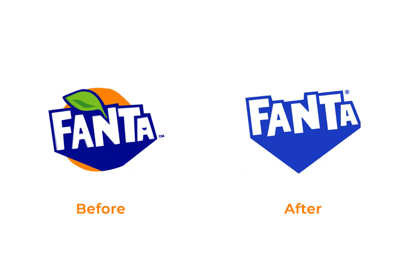
However, recently Fanta has rebranded its logo. After years of Fanta being associated with its iconic orange symbol, it has finally said goodbye to the citrus fruit icon. With the disappearance of the orange fruit and green leaf icons, the Fanta logo became a simple wordmark logo.
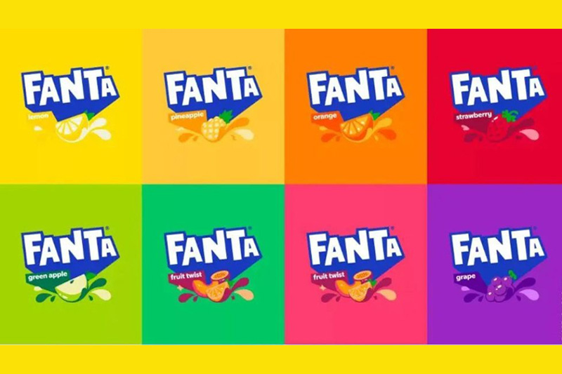
The latest version of the logo presents a streamlined design that contrasts with previous versions, yet Fanta turns simplicity into a playful twist with its bold wordmark. The background color changes to reflect the unique flavor of the product. The background will feature a vibrant orange for the orange flavor, a rich purple for the grape variety, and a bold red for the strawberry option. Colorful backgrounds in the logo enhance the playful and enchanting appeal of Fanta. This is precisely why we can confidently describe the logo as a playful logo.
Although Fanta’s new logo is simpler and more modern, it nevertheless exudes playfulness with its color palette, bold and assertive letter characters, and uneven letter shapes. This conveys the brand’s image as a refreshing and joyful drink.
Baskin Robbins
Lastly, there’s the logo for the latest Baskin Robbins, which we can consider playful. Despite a more mature and elegant approach compared to the previous logo, Baskin Robbins still maintains a cheerful and free-spirited impression with a more contemporary and versatile design featuring 31 ice cream flavors.
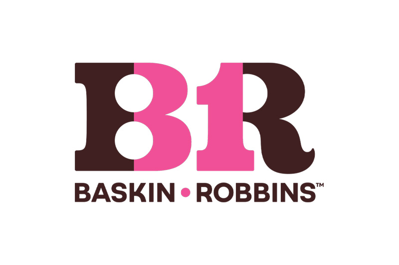
In its latest logo, Baskin Robbins uses cheerful color variations, namely pink and brown. It employs a striking contrast between the two colors to create the number 31, which symbolizes Baskin Robbins’ claim of offering 31 flavors. The typography of the Baskin Robbins logo uses a serif font for the “BR” logogram, which forms the number 31. The font is thick and strong, helping the logo remain readable. Additionally, the use of a rounded serif makes it appear less rigid. Meanwhile, the bottom part that says “Baskin Robbins” uses a rounded and simple sans-serif font, creating a friendly and approachable impression for children.
Baskin Robbins is the largest ice cream franchise in the world. Baskin-Robbins was founded in 1945 by two American brothers-in-law, Burt Baskin and Irv Robbins, through the merger of their respective ice cream shops in Glendale, California. Until finally, they joined forces to create the “Baskin Robbins Ice Cream” store that we know today.
Baskin Robbins demonstrates that a playful logo doesn’t always have to be childish but rather that it creates a cheerful, lighthearted, friendly, and entertaining impression within its visual and value context.
In conclusion, the appropriate use of a playful logo can help a brand convey an impression to its audience. Especially if a brand emphasizes a cheerful and fun impression, such as toy brands like Lego, Play-Doh, and Toys R Us, or even Baskin Robbins, using a playful style will be very helpful for the brand in creating that impression with the audience.
It’s important to remember that a playful logo is just one of many logo styles available. There’s no need to force this style into your logo if your brand doesn’t emphasize the values of the playful style. There are many other logo styles that can be used for a brand, which may be discussed later. Therefore, stay updated with our other intriguing content.


