Chunky Font Pairing for Your Coffee Shop Creative Branding
In the world of graphic design, the use of bold typography has recently been popular due to its ability to make a strong impression and capture people’s attention. Words with large and compact characters are frequently used to emphasize the main message and reinforce a brand’s visual identity. Among the variety of developed typography styles, chunky font is one of the prominent choices due to its solid, bold, and recognizable shape.
Even though the chunky font has a strong visual character, it requires additional touch to make it appear balanced and harmonious. To achieve harmony, designers frequently combine the font with lighter and friendlier wording. One option is to use the chunky font pairing technique, which involves combining chunky font styles with other types of fonts. It has the potential to produce a visually appealing, fascinating, and balanced composition.
Chunky font pairing can create an appealing visual look when used in a specific branding context, such as a coffee shop. Based on its shape and character, a chunky font can represent a coffee shop’s warm, friendly, and welcoming image. Hence, this article explores how chunky font pairing can enhance the visual identity of a coffee shop by creating a typography combination that combines visual power and brand character. With proper application, this style not only creates an appealing visual but also constructs an atmosphere that is in harmony with the coffee shop’s brand identity.
Table of Contents
10 Inspirations of Chunky Font Pairing for Coffee Shop Branding
Every coffee shop has a unique tale to tell, and typography has proven to be an excellent tool for doing so. Through chunky font pairing, the shop owner can display the brand’s character that is vibrant, firm, but still friendly. The right typography combination can show a visual experience that matches the brand character to customers. The following are ten chunky font pairing examples for coffee shop branding:
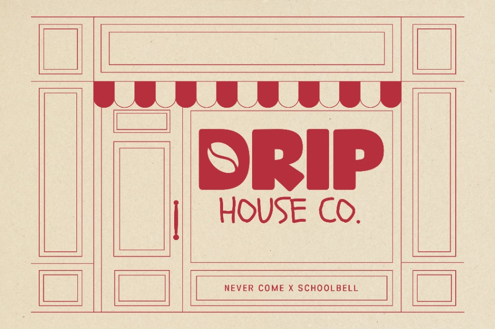
Never Come x Schoolbell
The Dormes x Walter Turncoat
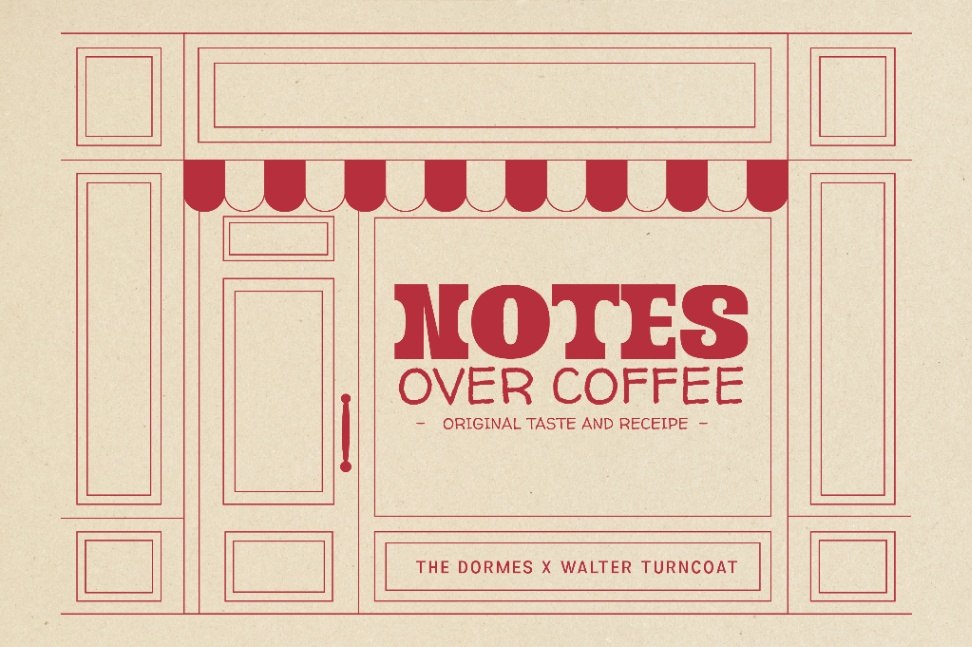
In the “NOTES OVER COFFEE” design, the chunky font combination in The Dormes and Walter Turncoat demonstrates how the typography style contrast may build a strong, yet pleasant brand identity. The Dormes features a bold letter character with a broad serif that creates a stable, firm, and recognizable impression, making it ideal for usage in the main element of a brand name or logo.
On the other hand, Walter Turncoat has a light and expressive handwriting style. The asymmetric letter shape creates a casual and personal vibe. This font balances The Dormes’s formal look with an approachable and organic touch. This gives a warm and welcoming visual identity, in harmony with the typical characteristics of a coffee shop.
Roles Boys x Borel
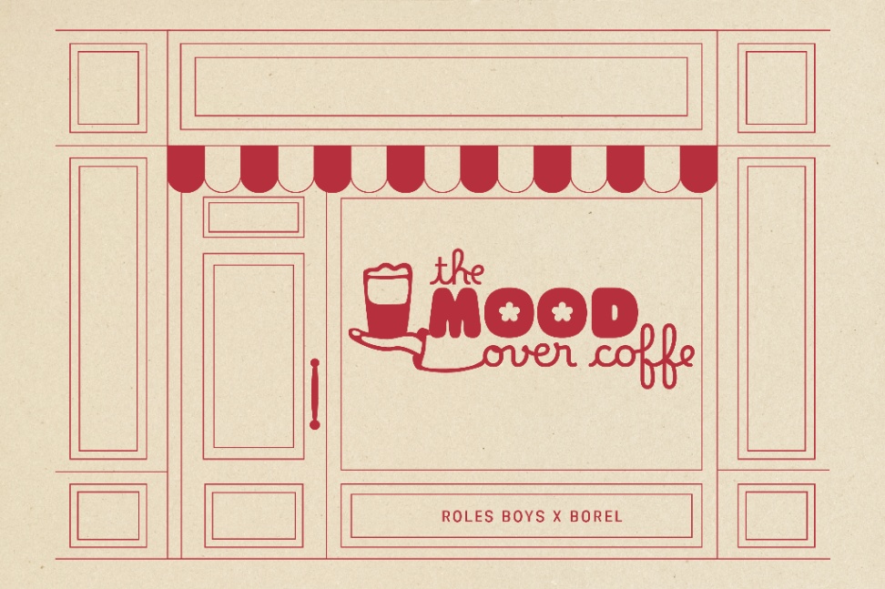
In the world of coffee shop branding, the combination of fonts frequently acts as the primary element in how the customers see the store even before they drink their coffee. The design for “The Mood Over Coffee” uses the combination of Roles Boys and Borel to make an elegant and pleasing visual contrast. Roles Boys has a bold, round, and solid letter shape, which is supported with big and rounded letter proportions, creating a visually friendly and accepted impression. Meanwhile, the decorative element of the “O” letter gives it a unique look in its visual identity.
As its companion, Borel comes with a flowing handwriting style, natural asymmetry, and a smooth curvature that go well together. Together, the two fonts give off a warm and friendly vibe, which is in line with the character of a coffee shop that wishes to appear close to its audiences.
Over Looks x Noto Sans
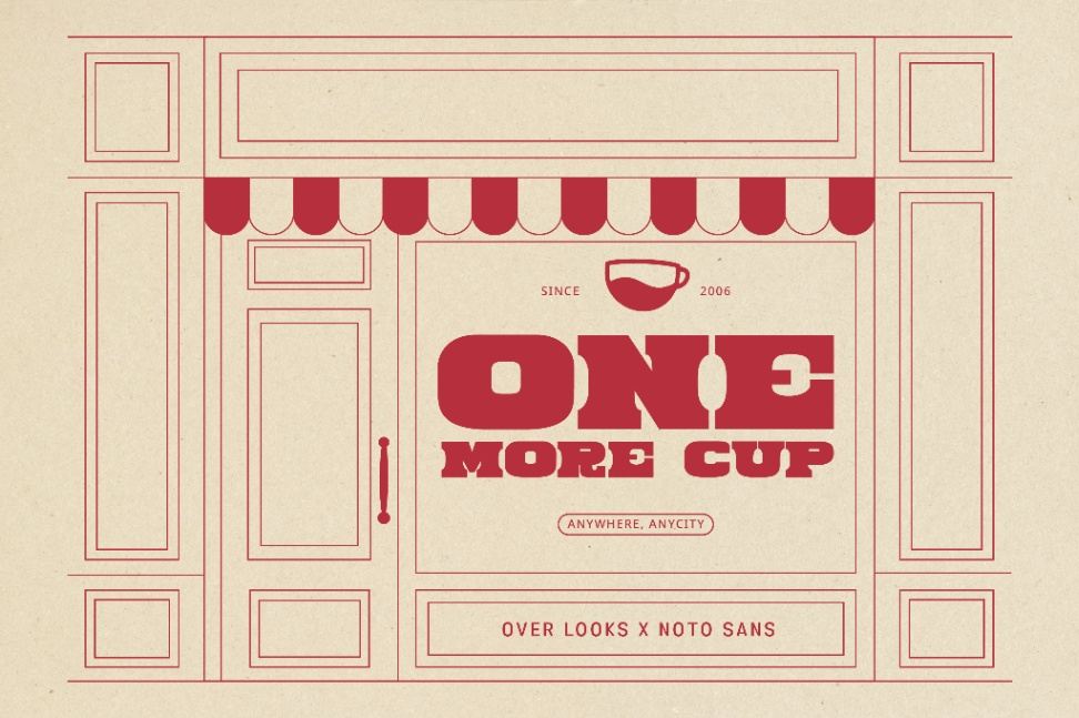
Over Looks and Noto Sans together visually represent a coffee shop brand that wants to appear bold and characterful. Over Looks has its distinct uniformed letter character with a bold stroke, classic structure, and solid proportion. Its characteristic gives a powerful visual weight, making it an effective major element in the logotype or signage to capture people’s attention.
Meanwhile, Noto Sans, which serves as the companion in this chunky font pairing, creates a neutral and clean appearance. The distinctive feature of this font is its simple yet firm strokes, which allows information to be presented clearly and professionally. The combination of the two creates a strong and easy-to-read visual identity in the context of coffee shop branding.
Nice Twins x Montserrat

This chunky font combination shapes the brand identity, characterized by its expressive visual contrast. Nice Twins is a chunky font with a really bold letterform, full dimension, and rounded ends. When used as the main element, such as in a logotype or signage, the solid characteristic creates a powerful and noticeable impression. Meanwhile, Montserrat—with its clean, proportional, and easy-to-read letter character—is a sans serif that serves as the complement.
The differences in visual mass and typography style between the two create a clear hierarchy, with Nice Twins as the primary element and Montserrat as the information provider. As a result, this combination creates a powerful, expressive, easy-to-remember, and relevant visual identity that reflects the dynamic character of the coffee shop’s brand.
Greny Wish x Nunito
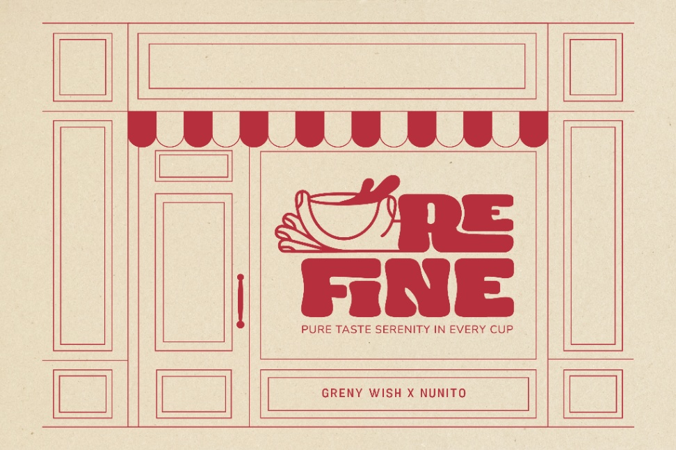
In planning a coffee shop’s brand identity, this chunky font pairing is able to show a strong vibe but still be welcoming. The combination of Grey Wish and Nunito creates a visually striking contrast. Greny Wish has a distinct feature from its solid and rounded letter mass. Several of its letter characters, especially the shapes of a, s, and w, provide an asymmetric curve, giving an organic and handwritten vibe.
To balance the powerful visual character, Nunito serves as a lighter and easy-to-read complement. This font has a balanced letter proportion, a round shape with a smooth line, and high readability, which is effective when used as supportive text or information. Nunito’s uniqueness lies in its ability to maintain a professional appearance without sacrificing its welcoming impression.
Bowlike x Fredoka

Imagine a coffee shop’s signage immediately catches your eyes, even before you smell the coffee. Bowlike and Fredoka create this appeal through their bold but still welcoming combination, which raises your comfortable feeling. The “Hit Bean” design uses a standout Bowlike with bold, solid, and round letter characters. Its large letter proportion with minimum contrast stroke gives off a powerful, stable, recognizable vibe. Its uniqueness lies in the rounded shape of the letter joints, adding a warm and dynamic impression.
Complementing Bowlike character, Fredoka offers a lighter, more readable visual balance. Its uniqueness lies in the consistent rhythm between the letters, creating a clean, pleasing text. In the context of coffee shop branding, this chunky font combination creates a typography that is not only aesthetically strong but also communicative and easily applied to various media.
Tracky Throw x Outfit
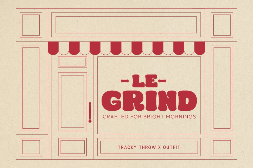
This chunky font pairing creates a vibrant yet trustworthy image for the coffee shop brand. Le Grind coffee shop’s branding uses Tracky Throw as the primary font to capture attention. This thick font features rounded characters that evoke a warm, groovy, and nostalgic vibe, enhancing the brand’s distinctive image.
On the other hand, Outfit, with its clean sans-serif aesthetic, complements the tagline “Crafted for Bright Mornings,” ensuring the clarity and sharp readability. This combination stands out due to its intentional visual contrast, where the bold personality of Tacky Throw’s expressive character is harmoniously complemented by Outfit’s clean and functional letterform.
Label Comfort x Gabarito
Achieving a perfect balance between form and function is essential for creating captivating visuals in branding. Label Comfort and Gabarito are a chunky font pairing that not only showcases the brand but also creates a warm, inviting atmosphere in a coffee shop. Label Comfort is characterized by thick strokes, flowing contours, and soft letter terminals, creating a bold yet friendly impression. The uniqueness of this font is evident in its dense, slightly organic letter silhouettes, giving it a handmade feel that still feels solid and distinctive.
On the other hand, Gabarito stands out for its harmonious proportions, pleasant letter height, and clean letterforms. Its uniqueness lies in its capacity to maintain a neutral yet elegant presence, making it ideal as a companion to more expressive display fonts. This blend is perfect for coffee shop branding aiming to highlight a relaxed vibe, artisanal offerings, or a community-focused approach.
Dome Tent x Instrument Sans

The thick Dome Tent showcases a daring, hand-drawn design, perfectly balanced by the simplicity of Instrument Sans. The Dome Tent is the focal visual element, featuring striking letterforms and an uneven brushstroke texture that delivers a powerful and expressive impact.
This dominant bold vibe is contrasted by Instrument Sans, a geometric sans-serif font with precise shapes and exceptional readability, as showcased in the tagline “WAKE. SIP. REPEAT.” The collaboration successfully blends heartfelt and casual elements, ideal for coffee shops seeking a playful and memorable image.
Conclusion
Every chunky font pairing offers a different approach in crafting a coffee shop’s visual identity. Typography not only serves to reinforce the logo and tagline but also builds an atmosphere that is instantly recognizable. The balance between bold, expressive letterforms and clean companion fonts creates a visual harmony that powerfully and consistently represents the brand’s character.
With your newfound harmony of chunky font, it’s time to integrate this style to the brand identity. Begin by identifying the coffee shop’s persona you wish to showcase. Next, select a chunky font pairing that best reflects that character. Finally, create a visually appealing brand that leaves a memorable impact for coffee enthusiasts.