Font Pairing For Children’s Books: 10 Stunning Fonts for Creative Designs
Children’s books are more than just a collection of stories. In fact, they are the window to the world of imagination. Children’s books function not only as an entertainment medium but also as an education tool to shape children’s character. Each page of a children’s book offers a simple yet meaningful story, complete with illustrations that help children understand the content easily. Visual appearance is an important element for this type of book since it can strengthen the visual appeal and keep children’s attention. In this case, one of the visual elements needed is font pairing for children’s books. Why font pairing? The purpose of font pairing is to perfectly harmonize the text with the illustration, thereby making the story feel more lively, captivating, and friendly for its intended audience.
For instance, a children’s book that tells a story about a rabbit running so fast will look less appealing if we utilize a rigid and plain font. On the other hand, the use of friendly and playful fonts will make children enjoy reading as well as feel related to the story being told.
The main challenge of planning the typography used in children’s books is to attain a balance between readability, aesthetics, and visual appeal. Relying on one type of font most likely makes everything feel monotonous. As a result, designers often try to combine typography as the best solution. Use simple fonts for the story and expressive ones for the title and dialogue. Hence, in this article, we will discuss our 10 ultimate font pairings for children’s books while introducing the essential typography principle in designing the books.
Table of Contents
Why is Typography Important in Designing Books?
Typography plays an important role in creating a comfortable and relaxing reading experience. The right font can enhance readability, making it easier for children to recognize words and sentences. The visual character of the letters also helps to build the atmosphere of the story, whether it is cheerful, warm, or full of adventure. Thus, the selection of appropriate typography not only conveys the text but also enriches the child’s imagination and encourages them to enjoy reading more.
The Best Font Pairing for Children’s Books: Yumnatype’s Ultimate Collections
One type of font usually is not enough to create an appealing display for the children’s books. That’s why we have curated some special combinations that offer optimized readability that feels cheerful at the same time. The following are font pairing ideas for children’s books to inspire you:
Ranhart x Lato
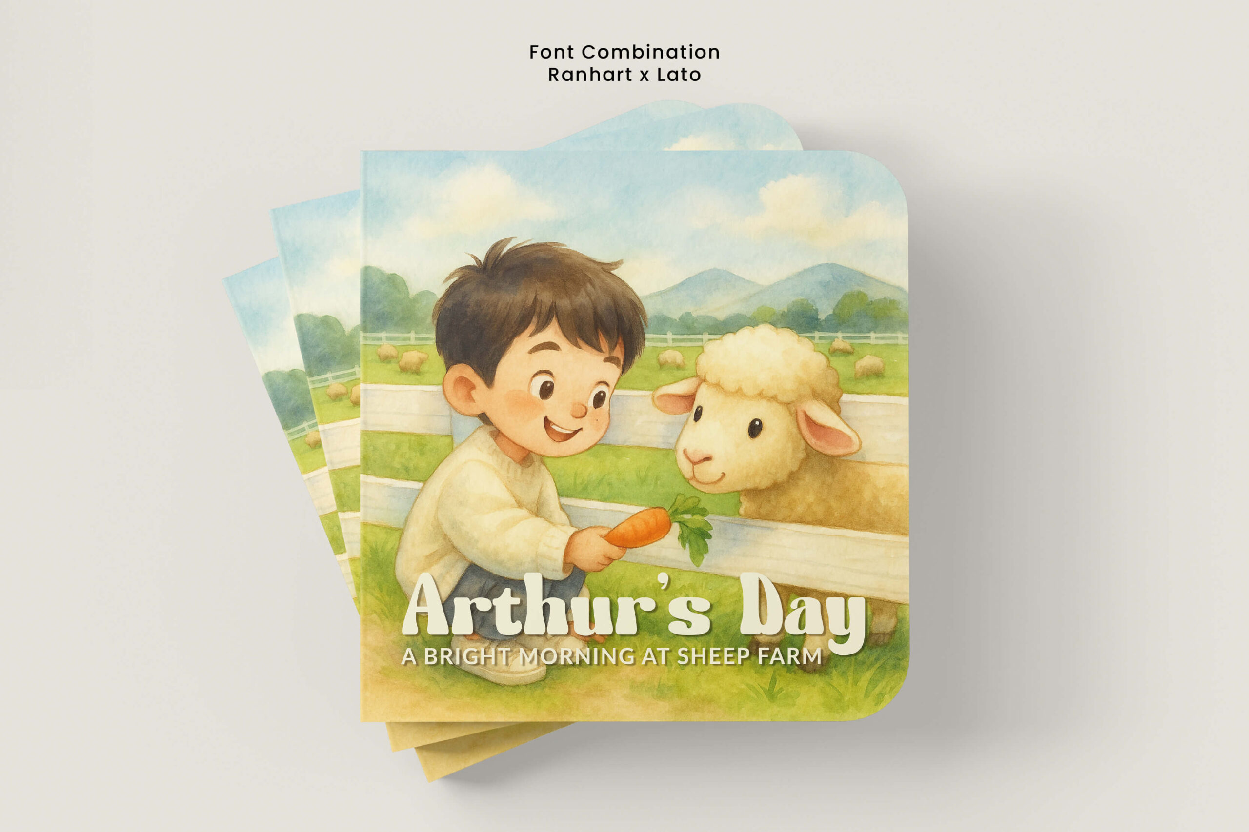
The Ranhart x Lato combination is an excellent font pairing for children’s books due to its warm, joyful, and imaginative feel. On the one hand, Ranhart is a display font with a bold, rounded, and lively character, making it ideal for an eye-catching title. On the other hand, Lato is a modern sans-serif font with clean lines and excellent readability. Its welcoming tone effectively conveys information in a subheading or body text without detracting from the title. This font combination is ideal for creating a welcoming visual harmony in children’s books for kindergarten through elementary school students.
Trailing Down x Pacifico
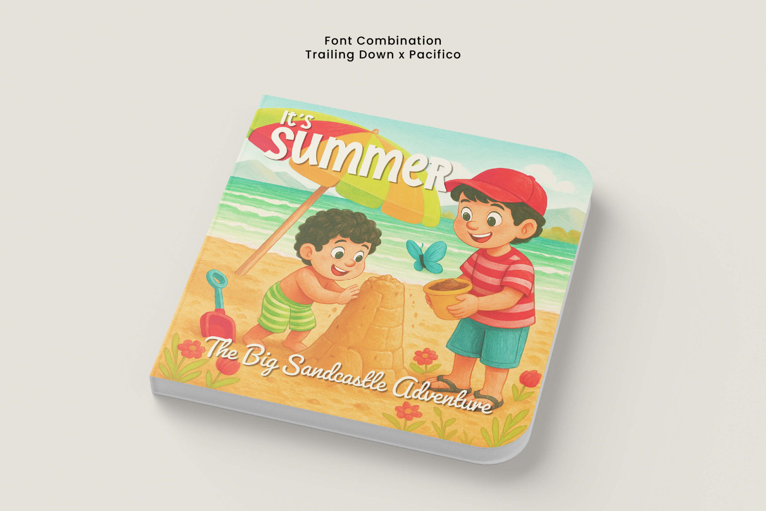
The next font pairing for children’s books is Trailing Down and Pacifico. The combination of these fonts creates a cheerful yet warm impression, fitting the theme of summer adventures. The Trailing Down font has characteristics of bold letters with a slight geometric touch that conveys a warm, bold, and still pleasant impression. This font brings energy, cheerfulness, and a spirit of adventure, making it suitable for use as the main title. Meanwhile, its pairing font, Pacifico, is used as a subtitle with a light and friendly appearance. This font is a script font with a handwritten style, featuring flowing, relaxed, and friendly letter characters. The combination of the two is very suitable for children’s books with themes of summer, school holidays, or other fun and challenging activities for kids.
Borner Wilds x Josefin Sans 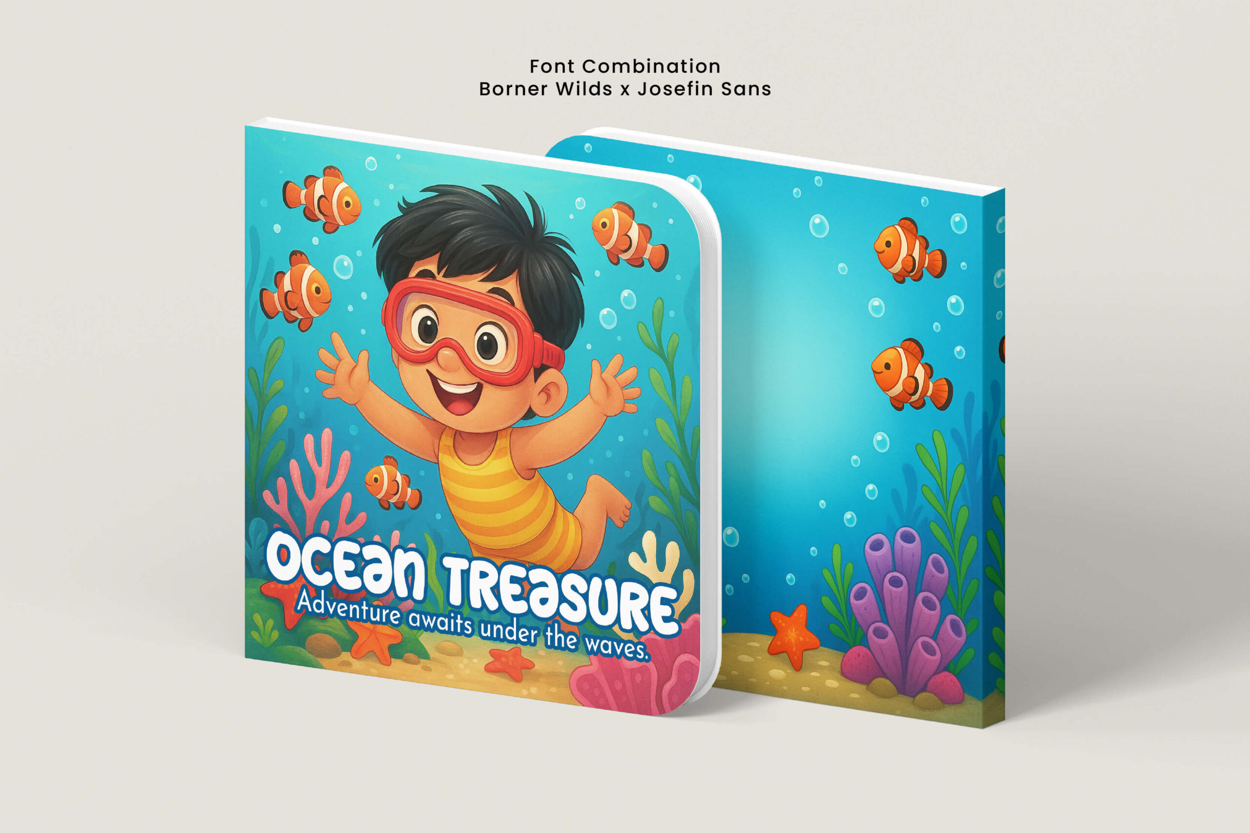
Introducing another font pairing for children’s books worth using, Borner Wilds and Josefin Sans. The display font Borner Wilds features a bold, rounded, and full-energy character, making it an effective choice for the main title. The letters’ distinctive bubble-like shape draws attention and infuses the story with a cheerful atmosphere. Meanwhile, Josefin Sans is a modern sans serif with sleek, clean lines and a high level of readability. This font is suitable for subtitles or body text because of its simple and clear form. The combination of the two creates a visual balance suitable for children’s books themed around legends, friendship, or delightful imaginative stories.
Spring Sounds x Open Sans
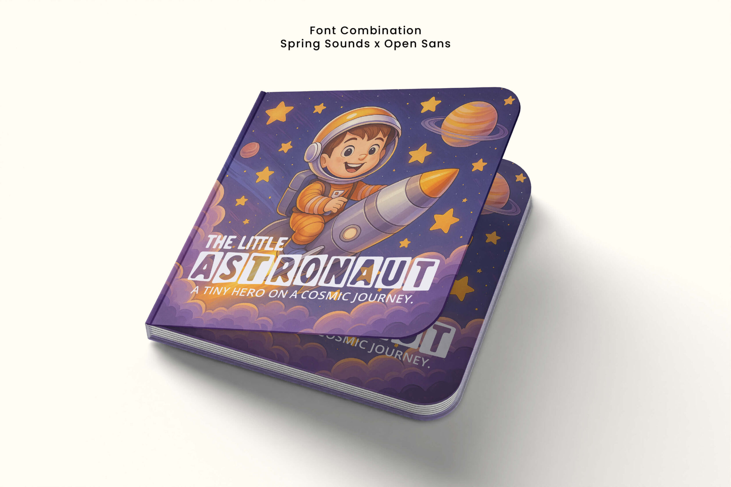
Spring Sounds and Open Sans are another great example of a young font pairing for children’s books. The title “The Little Astronaut” above is written in the Spring Sounds font, a display font with bold capital letterforms and a square-shaped frame that creates an incredibly imaginative appearance. Meanwhile, the subtitle is written in the Open Sans typeface, which is a simple yet modern sans-serif with excellent readability. The style of this font is suitable for both subtitles and body text due to its neutral and welcoming attitude. This font pairing for children’s books produces a stunning visual, making it ideal for autumn-themed children’s books with a friendship theme.
Birgaten x Roboto
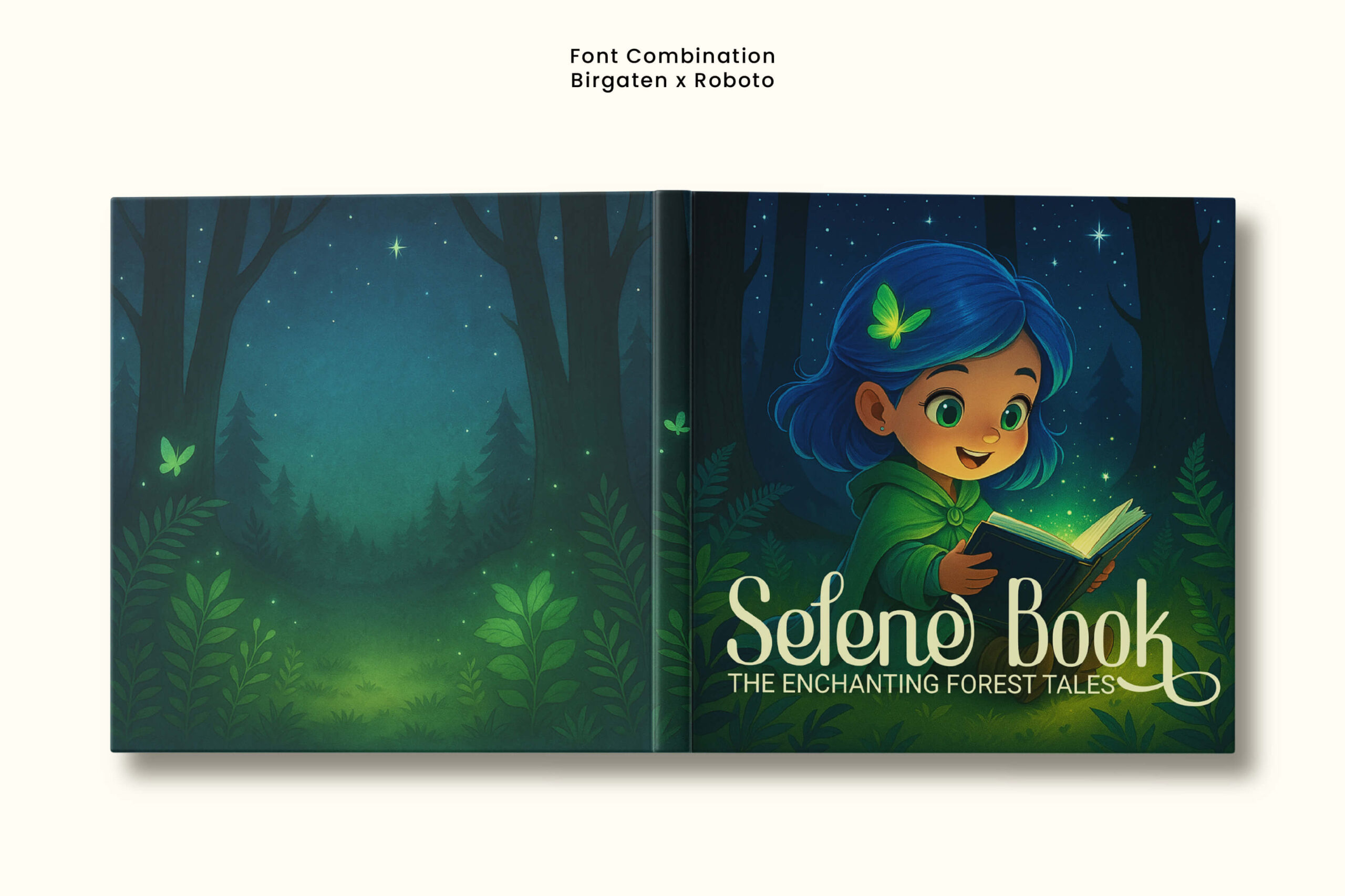
Birgaten is used as the main title with its lettering character in hand-lettering style, featuring smooth curves, balanced thick-thin strokes, and flowing tail details. Its unique letterforms attract attention and add a cheerful yet warm atmosphere that aligns with the world of children’s imagination. On the other hand, Roboto comes as a modern sans serif with clean lines, simplicity, and high readability. The neutral and friendly characters of this font make it ideal for the text content of children’s storybooks. This font pairing for children’s books presents an expressive yet easy-to-read appearance, creating a visual balance between expression and clarity. This combination is very suitable for application in children’s books with a fantasy theme or entertaining stories.
Reglues x Poppins
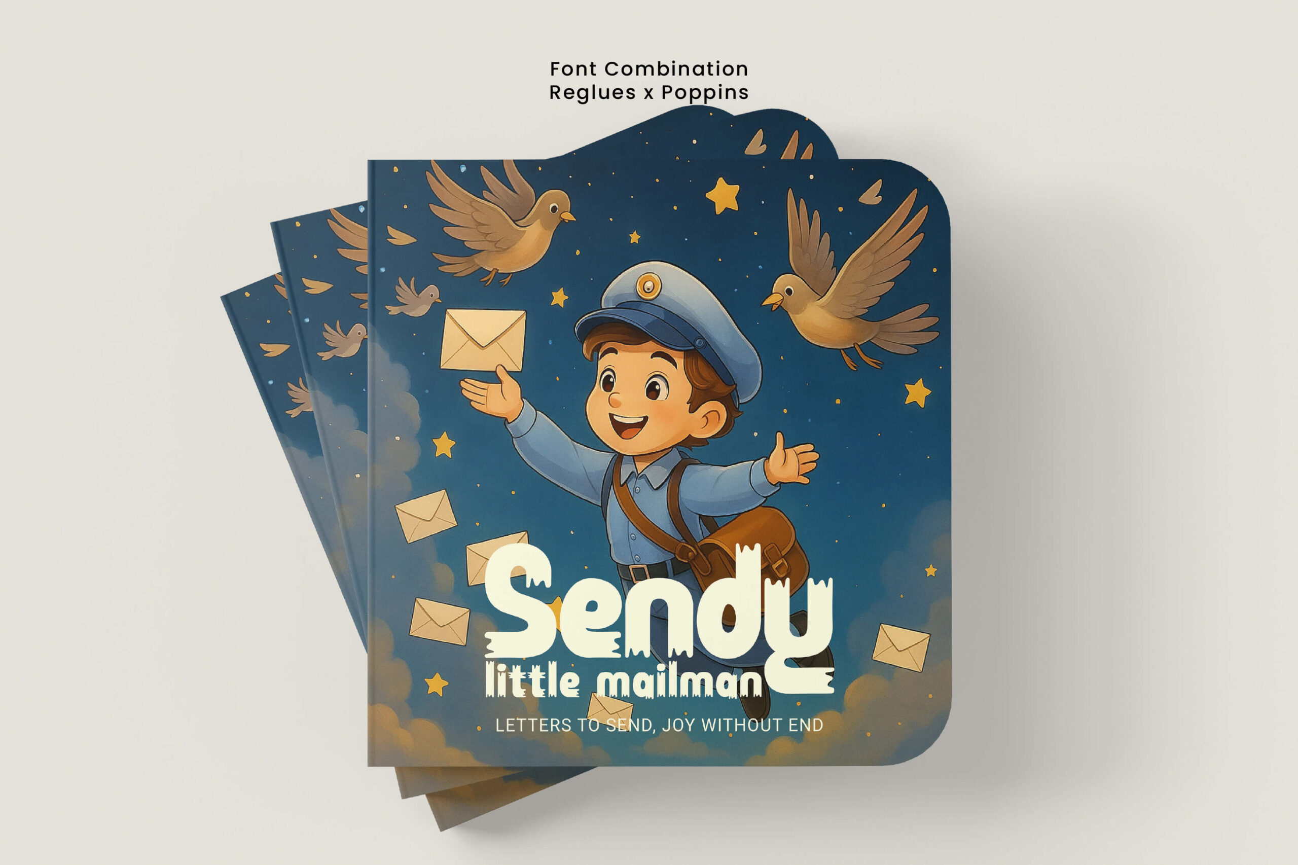
The combination of Reglues and Poppins on this children’s storybook cover creates a strong visual identity, making it easier for readers to be attracted to this work. Reglues serves as a display font with characters that have the right thickness, rounded shapes, and distinctive decorative elements. This font effectively draws attention to the main title while simultaneously conveying a sense of cheerfulness and boldness that aligns with children’s imagination and ambition. As a complement, Poppins serves as a modern sans serif with a simple geometric shape and high readability. This font is often used for the text content in children’s storybooks, general reading books, and interactive materials. The combination of these two fonts results in an expressive yet clear font pairing for children’s books, making it suitable for themes of heroic fantasy, moral stories, and tales with positive values that can inspire children.
Halgers Kindle x Source Sans Pro
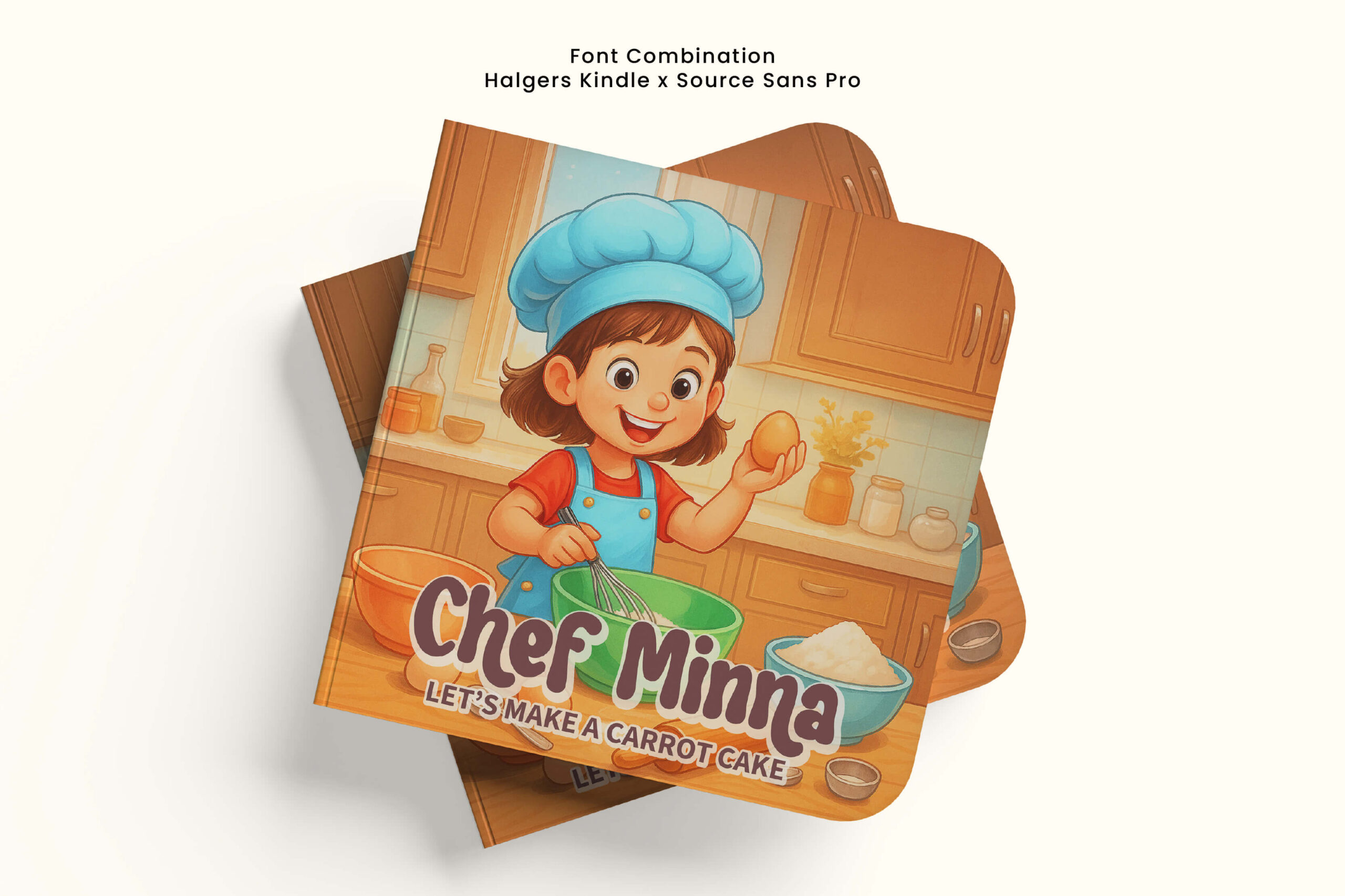
The following font pairing for children’s books is very suitable for books themed around learning new things or fun activities like cooking. The combination of Halgers Kindle and Source Sans Pro creates a balanced mix of expressive appearance and readability. Halgers Kindle is a display font with bold, rounded, and playful letter characters that convey a sense of energy. This font is effective for main titles because it can attract attention while also visualizing children’s imagination. On the other hand, Source Sans Pro is a modern sans serif with simple, neat lines and a high level of readability. The neutral and friendly characters of this font make it ideal for subtitles as well as body text.
Triple Disco x Quicksand
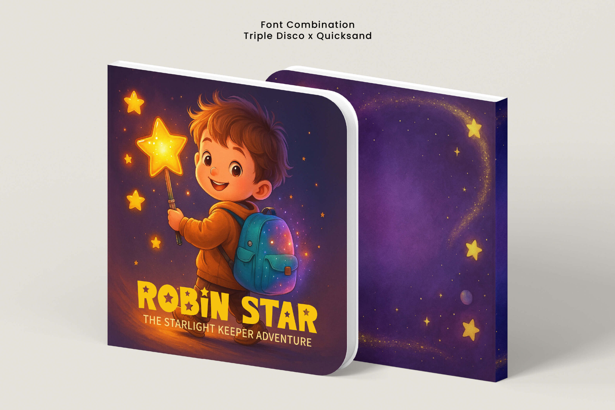
The combination of Triple Disco and Quicksand on the children’s storybook cover creates a dynamic yet easily recognizable atmosphere. Triple Disco is a display font with bold uppercase characters combined with decorative stylistic alternates that effectively draw attention to the main title. Meanwhile, Quicksand is a modern sans-serif font with round, clean, and friendly characters that support optimal readability. This font clearly supports both subtitles and body text without detracting from the title. Both create a harmonious font pairing for children’s books, ideal for stories with themes of imagination, adventure, or entertaining tales.
Yearself x Tenor Sans
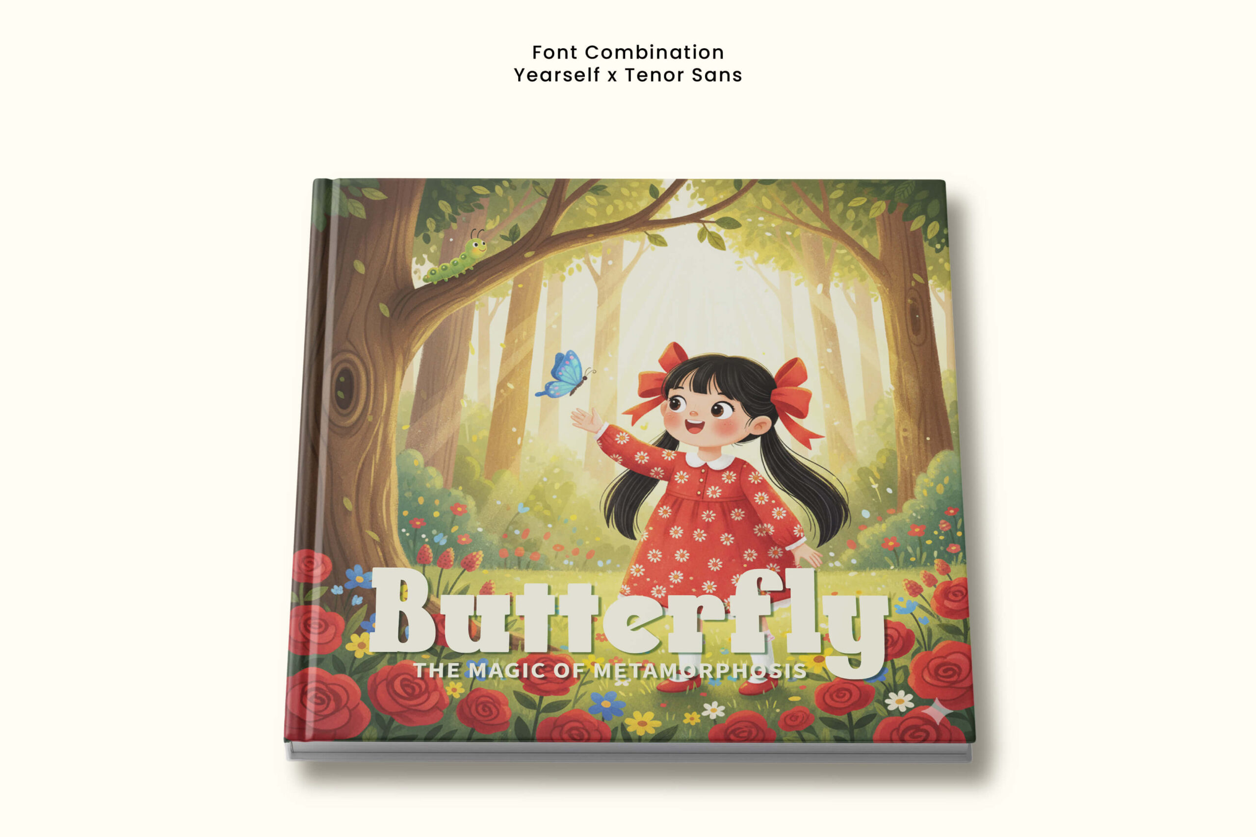
Yearself is a slab serif font that serves as the main title. The letter characters are bold, firm, and sturdy, yet they still convey a cheerful and friendly impression, making them capable of being the main attention grabber. On the other hand, Tenor Sans appears as a modern sans serif with clean lines, proportional shapes, and a high level of readability. The neutral, friendly, and simple characters of this font support both subtitles and body text, ensuring that information is conveyed clearly without diverting focus from the title. In the context of font pairing for children’s books, this combination highlights visual beauty while establishing an orderly text hierarchy. This combination is suitable for children’s books that address themes of natural science or other educational topics.
Cowboy Dunes x Raleway
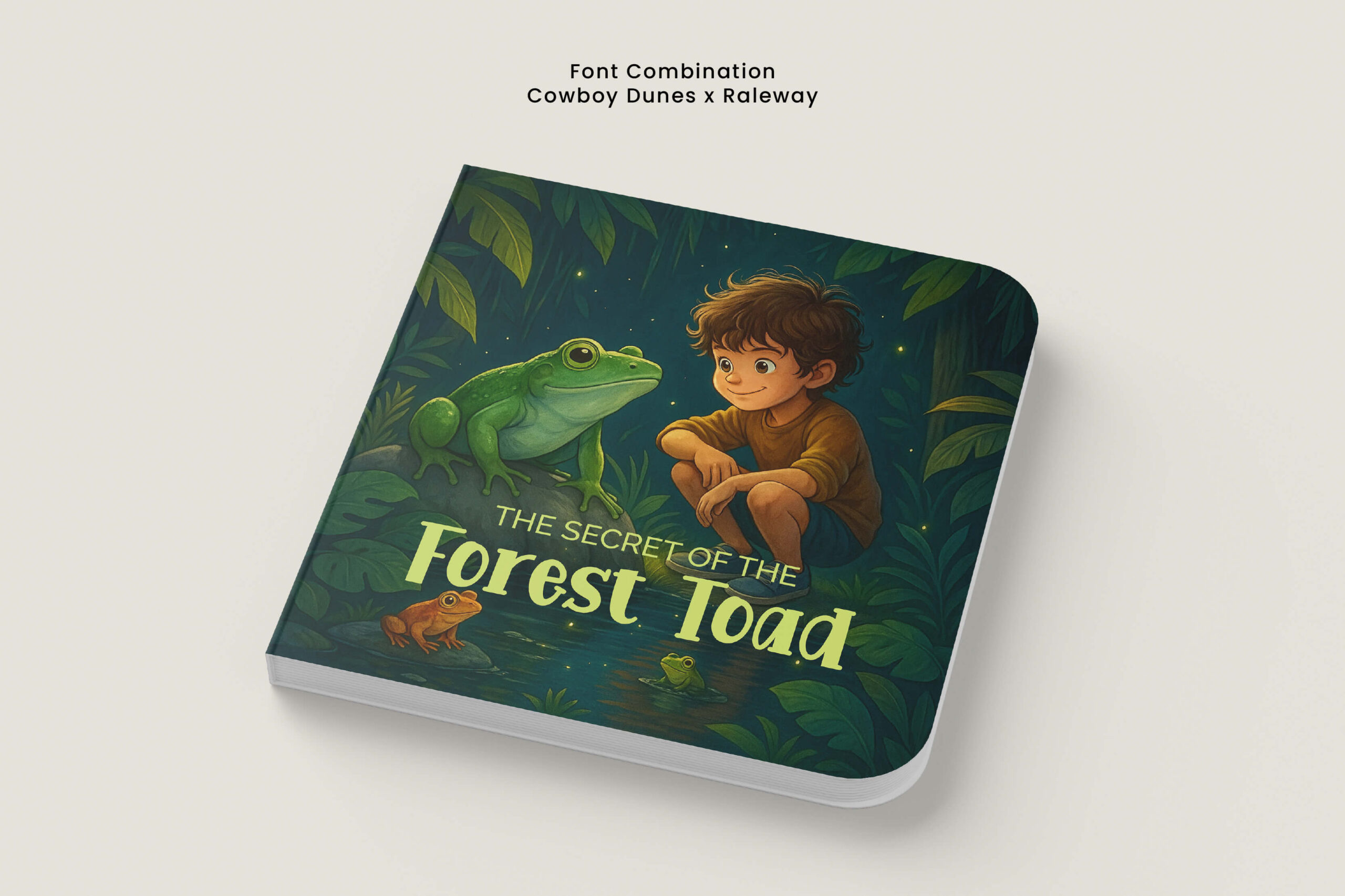
Last but not least, there is a combination of Cowboy Dunes and Raleway, which brings a balance between visual expression and text readability in children’s books. Cowboy Dunes is a display font with bold, rounded, and playful characters that can attract attention to the main title while also building an imaginative atmosphere. On the other hand, Raleway is a modern sans serif font with sleek, clean, and proportional characters that ensure subtitles or additional information remain clear and easy to understand. This font pairing for children’s books not only emphasizes a neat text hierarchy but also creates a warm and friendly atmosphere for the readers. This combination is suitable for books themed around nature, friendship, or educational adventures rich in imagination and learning values.
Final Thoughts
In conclusion, these 10 font pairings emphasize that typography is not only visual but also creates atmosphere and enhances readability for children. Each font combination presents a different character—from expressive, cheerful, to educational—so it can be tailored to the theme and values of the story the author wants to convey. By combining fonts appropriately, we can ensure that each children’s book can present a strong visual appeal while also conveying a message that is easy to understand. So, choose the right font pairing for children’s books and let typography support the child’s imagination to grow even further.